
Book Interiors
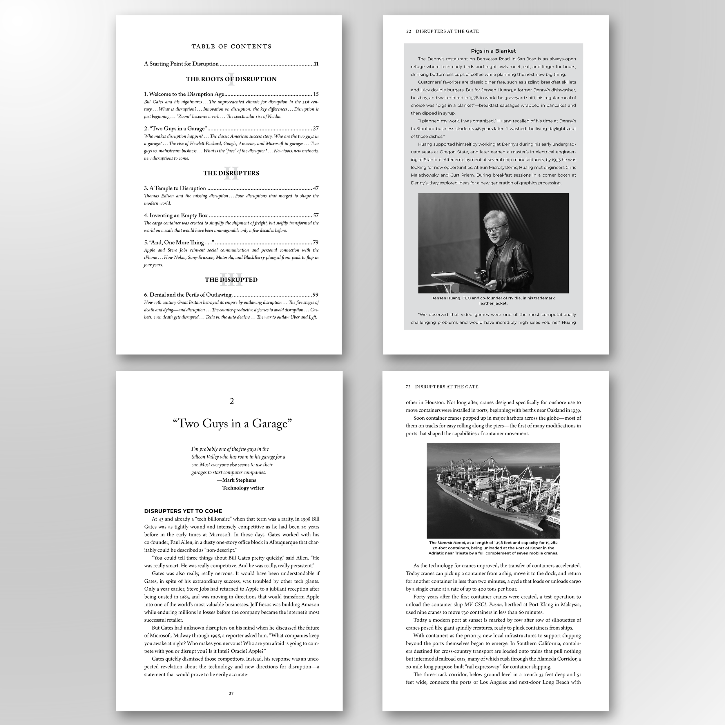
DISRUPTERS AT THE GATE. A massive 464-page non-fiction book written by two extraordinary authors, Jeffrey Cole and Harlan Lebo. More than 300 images and over 40 sidebars, highly researched, with an enormous index and an extensive bibliography.
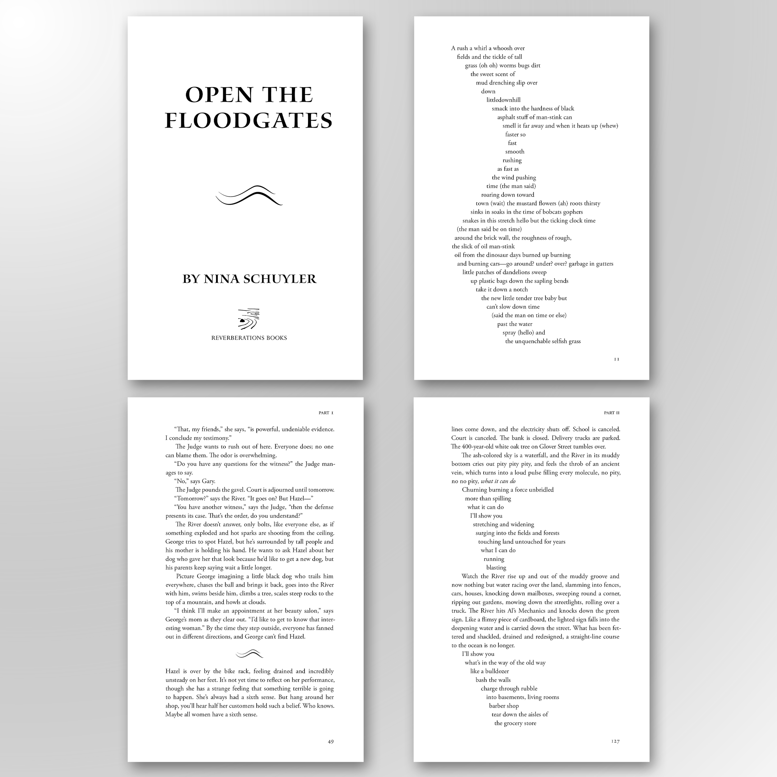
OPEN THE FLOODGATES. An experimental interior. It's prose is traditional while the river's thoughts and dialogue flow like a poem, like a river. This is a book worth reading and is an excellent additional to the climate fiction genre.
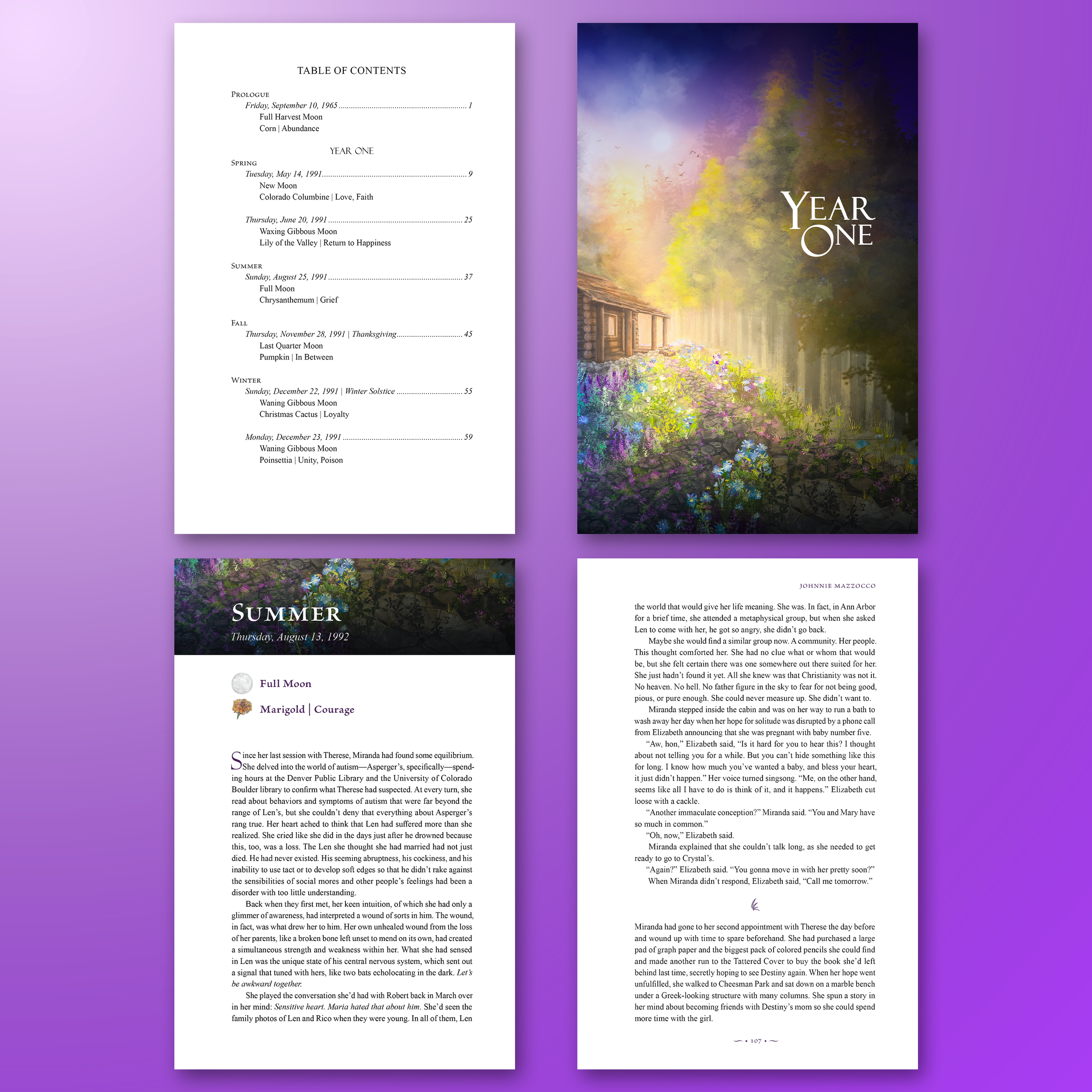
MIRANDA'S GARDEN. A four color interior that had over 90 illustrations of moons and flora. Every chapter started with a corresponding moon cycle and a corresponding harvest, and I used Lulu Chen's original front cover artwork to design the section and chapter pages.
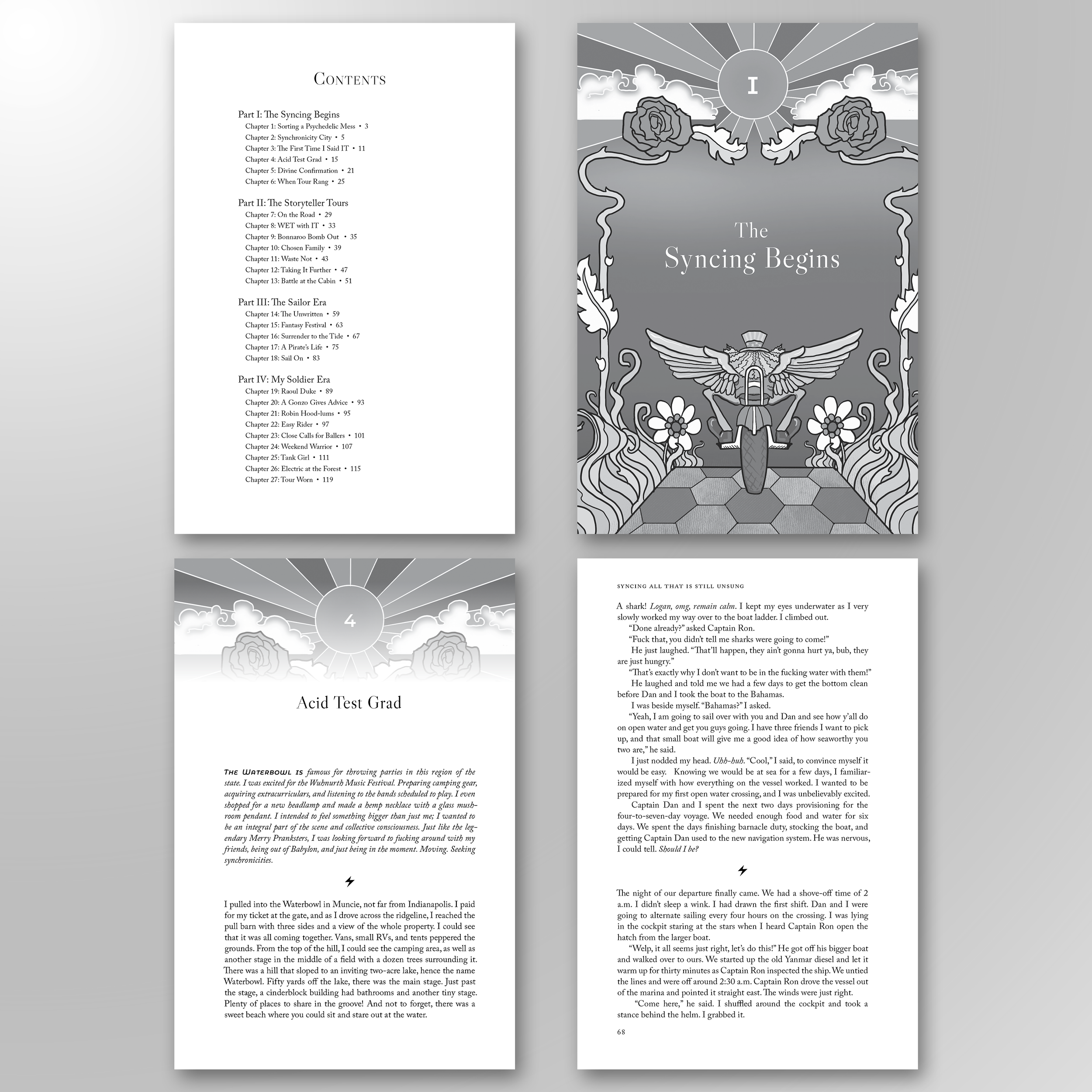
SYNCING ALL THAT IS STILL UNSUNG. A powerful memoir about Logan Lad's life, about him chasing bands, following synchronicities, riding motorcycles, and finding a career amongst addiction and getting sober. The book cover was designed by Erin Cadigan, and I integrated her illustrations to design section and chapter pages.
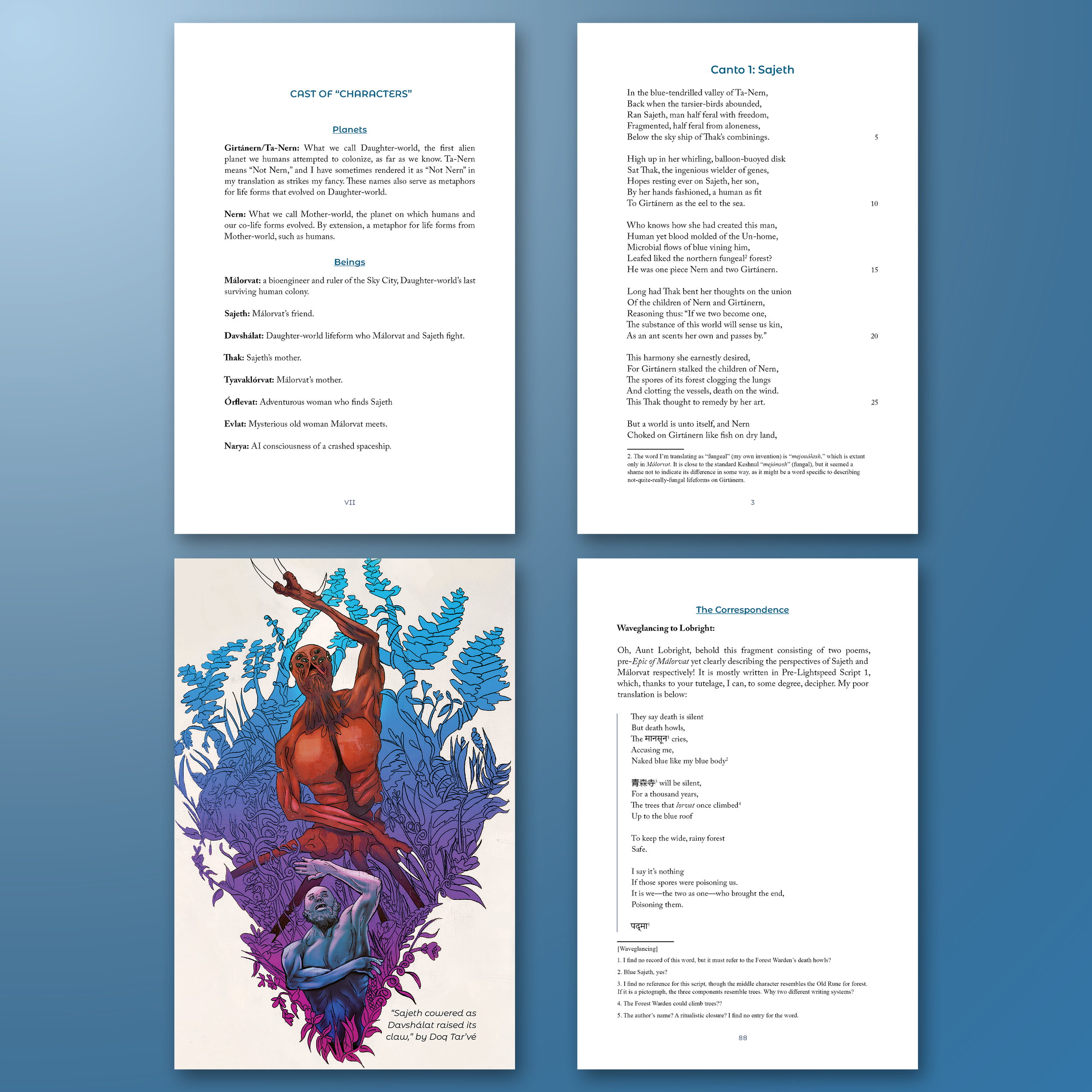
MÁLORVAT: THE FUTURE GILGAMESH. A challenging project that had an intricate framing of a book published in the year 4101. Filled with many illustrations by different illustrators, this book is primarily a long poem, and at its core, a future retelling of The Epic of Gilgamesh.
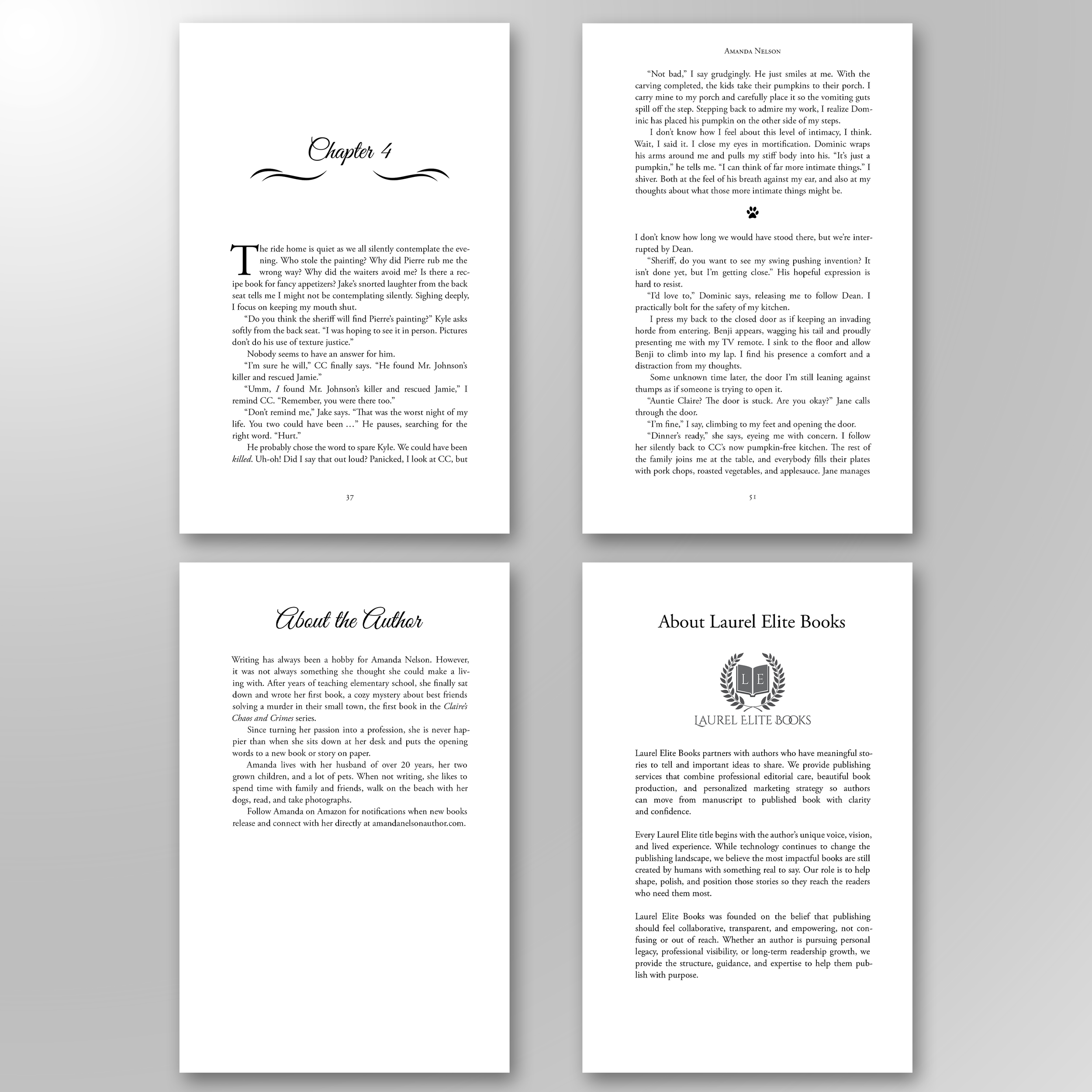
CLAIRE AND THE ARTIST PIERRE. A straightforward interior layout for this 268-page cozy mystery. Subtle ornaments for chapter headings, paw prints to mark scene breaks, maintaining a cozy mystery charm with a touch of romance.
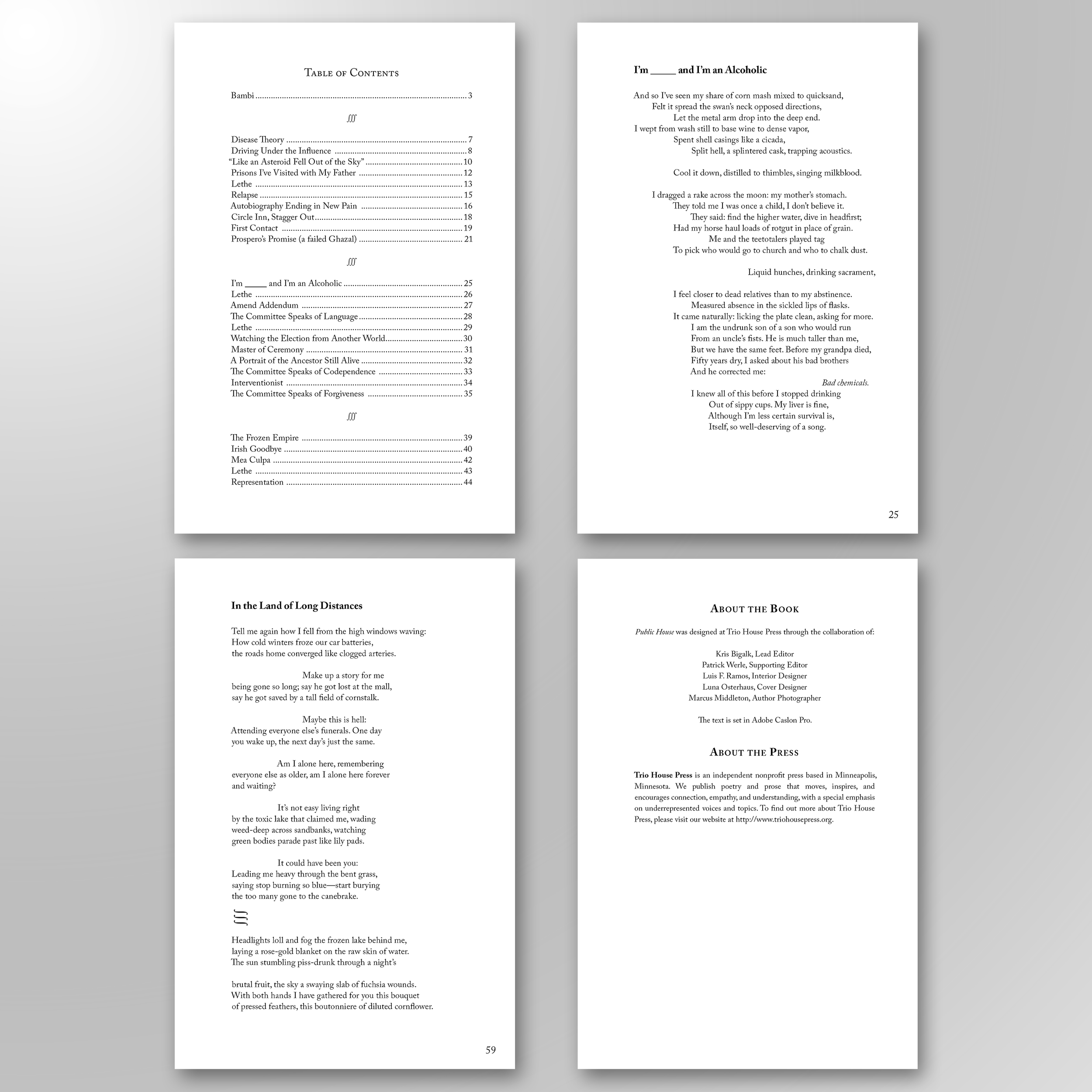
PUBLIC HOUSE. Freelance work with Trio House Press, a poetry publisher. This interior design required extensive collaboration with the author and presented unique layout challenges, particularly in translating visual poems from a Word manuscript into a 6 × 9 book format.
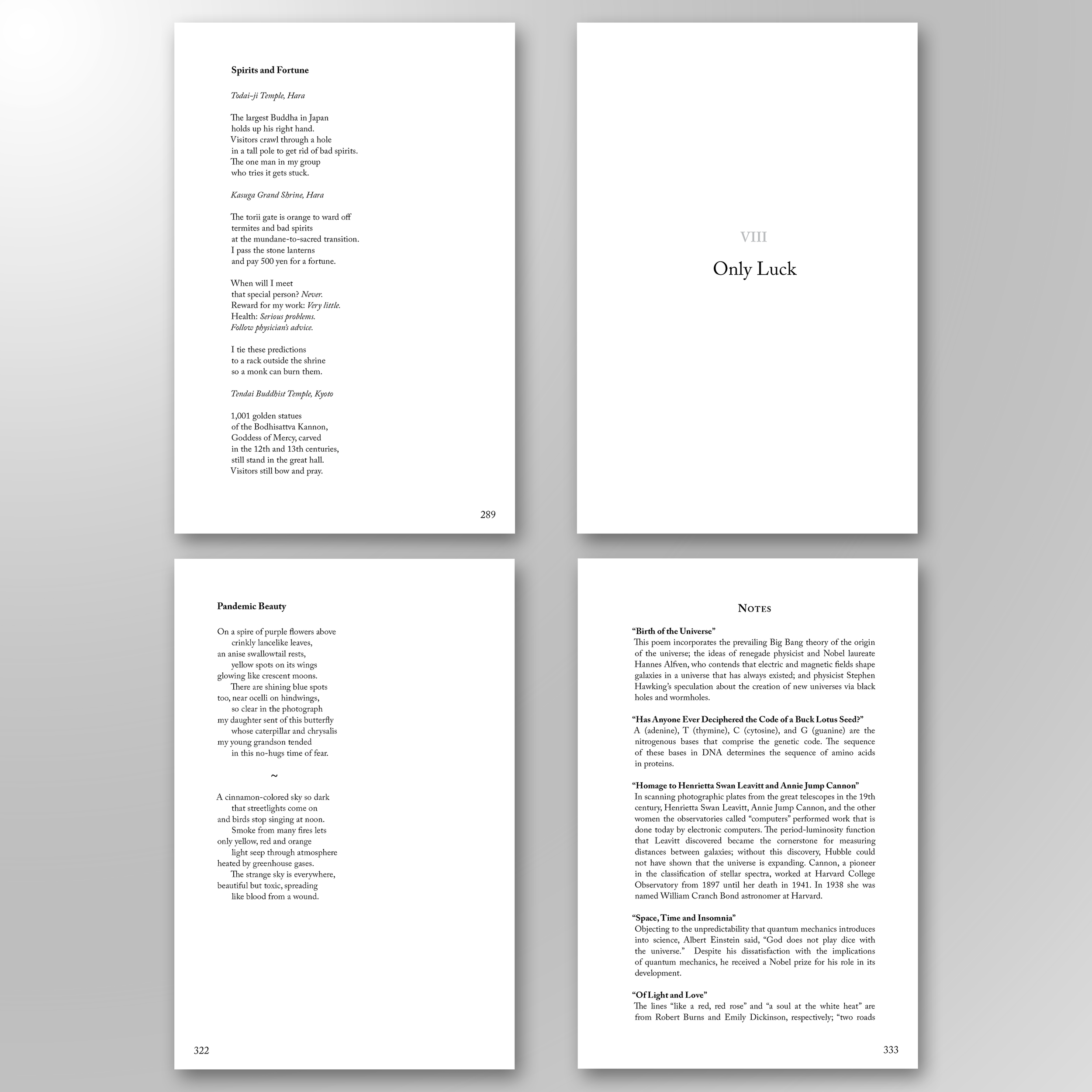
THE COSMOS AND ME. Another interior design project with Trio House Press, a poetry publisher. The primary challenge was the book’s scale, reaching nearly 400 page! Lots of proofreading, careful consideration of where and how to break poems, taking into account page turns, stanza breaks, and every poem's visual caesura.

THE PEOPLE IN THE ROOM. An intensely researched title with a substantial index. It was a project that took considerable time to lay out, and was continually being updated and refined until all indexing was properly marked and cross-referenced.
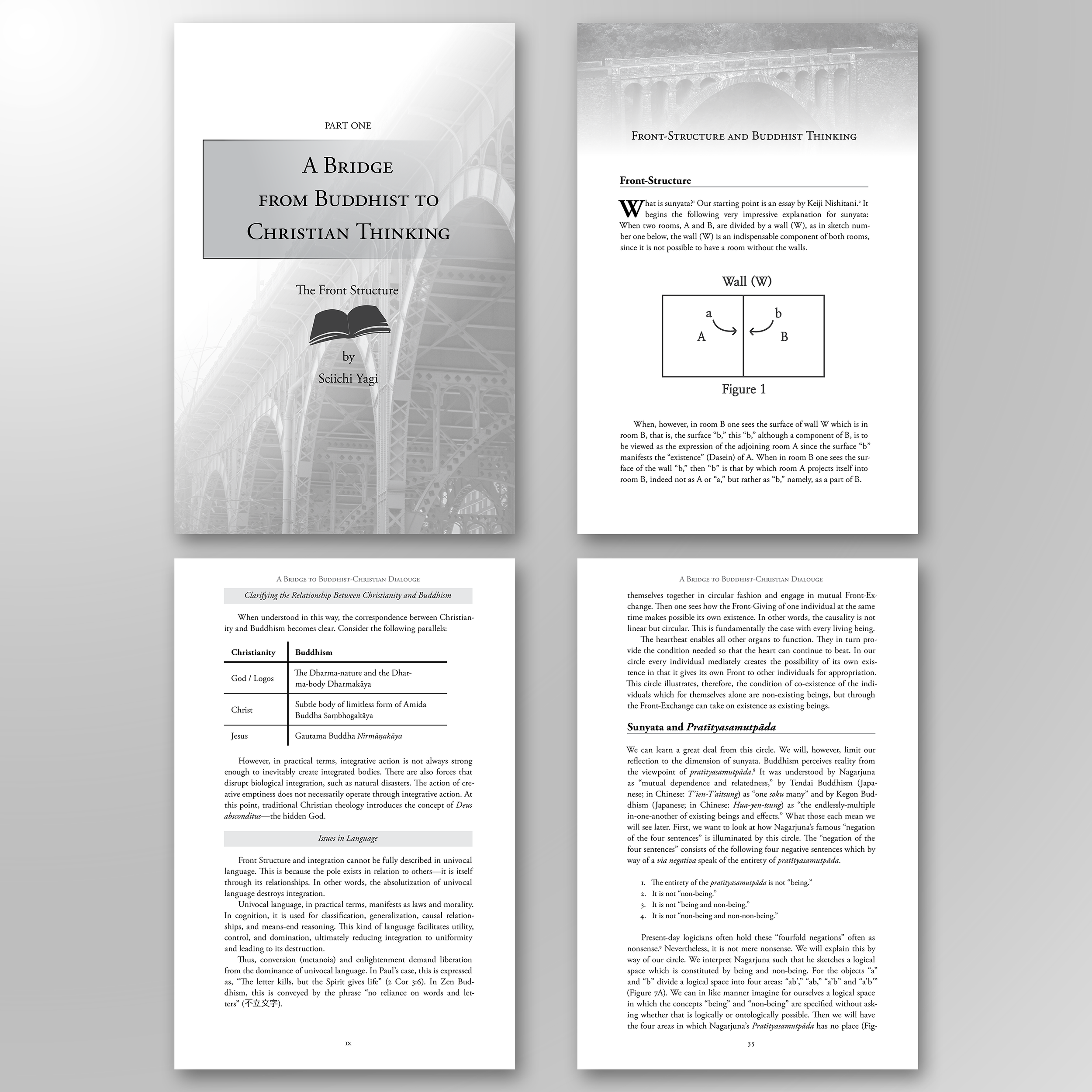
A BRIDGE TO BUDDHIST-CHRISTIAN THINKING. A complex design featuring numerous figures and extensive endnotes. While the content is philosophical and scholarly, I incorporated a few design elements—such as photos of bridges—to make the interior feel more approachable.
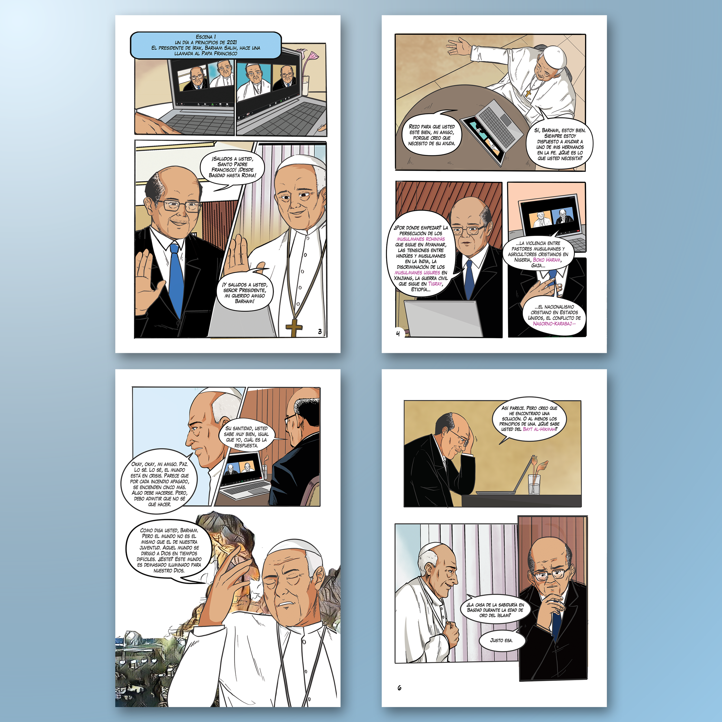
THE PEACEMAKERS (SPANISH EDITION). One of my first major projects at iPub, involving extensive production work on a large-scale title with complex illustrations. Responsibilities included repairing corrupted Photoshop files, correcting color anomalies, and producing editable text and comic balloons to support future translations.
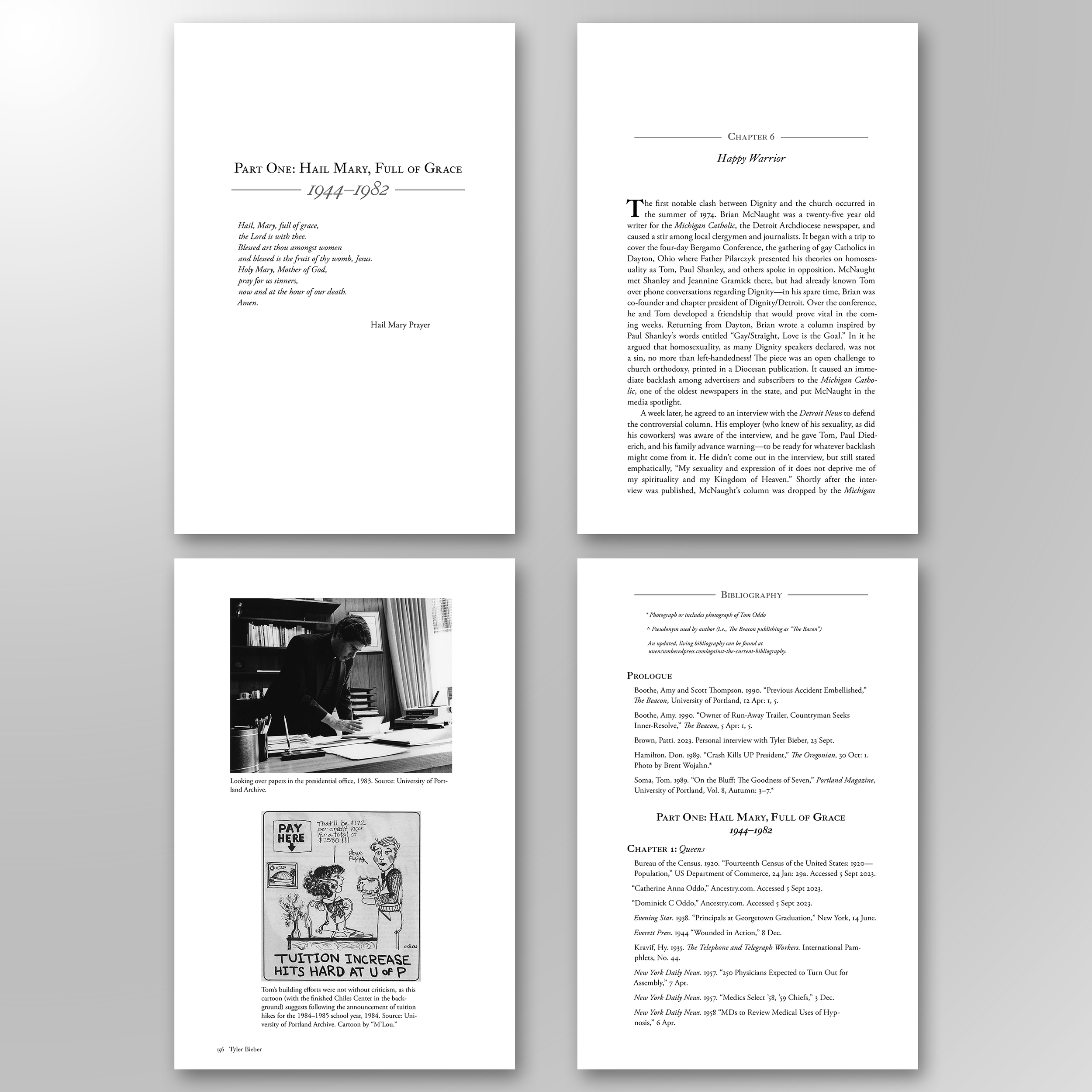
AGAINST THE CURRENT. One of my favorite projects that I have ever worked on. A biography about Father Tom Oddo, a catholic priest and gay activist from Portland, Oregon. Many photos, a giant bibliography, and many footnotes, as it was an intensely researched project.
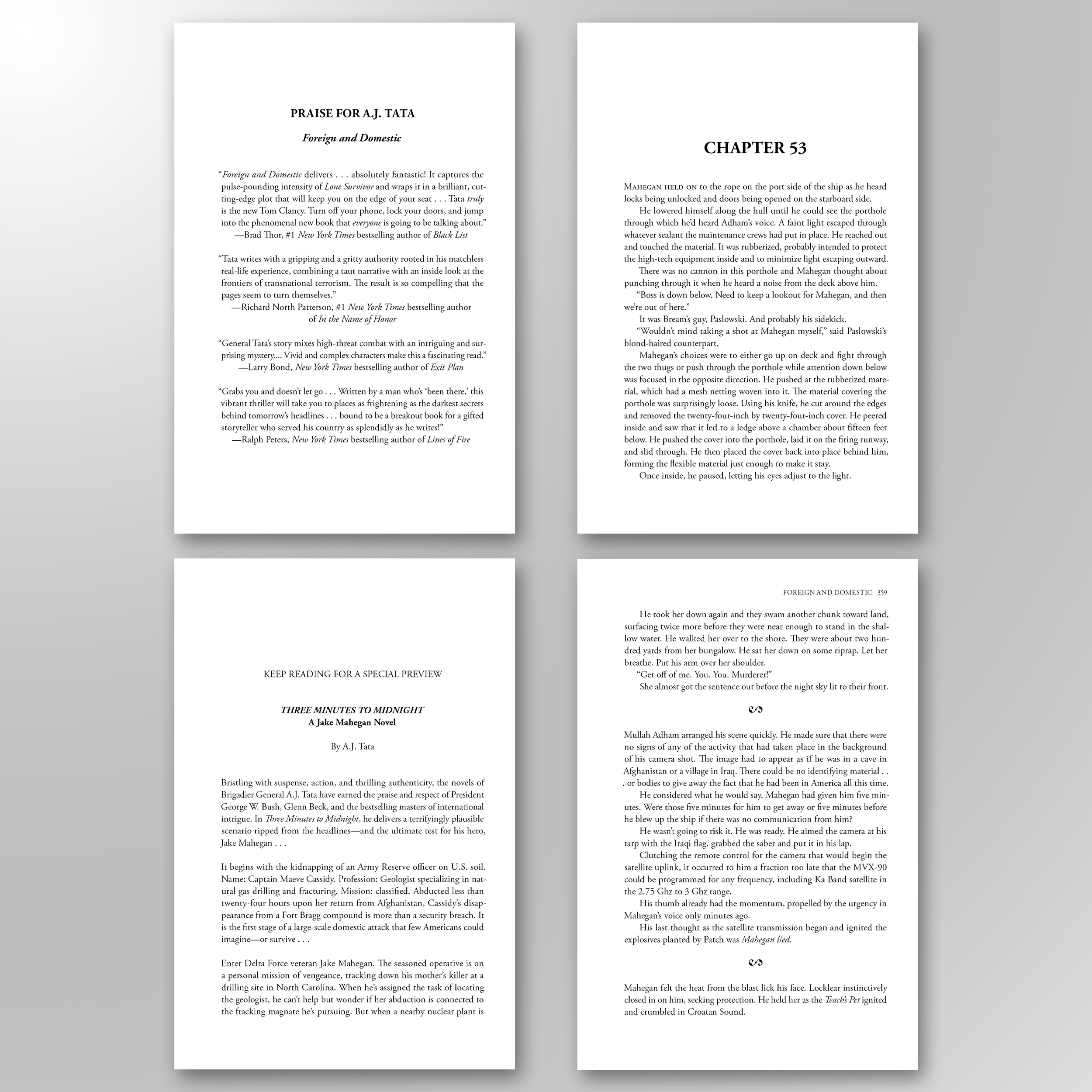
FOREIGN AND DOMESTIC. Freelance interior design work for Kensington Books on a reprint of a classic title. The project involved updating the layout with new praise pages and adding a feature preview showcasing the author’s next book.
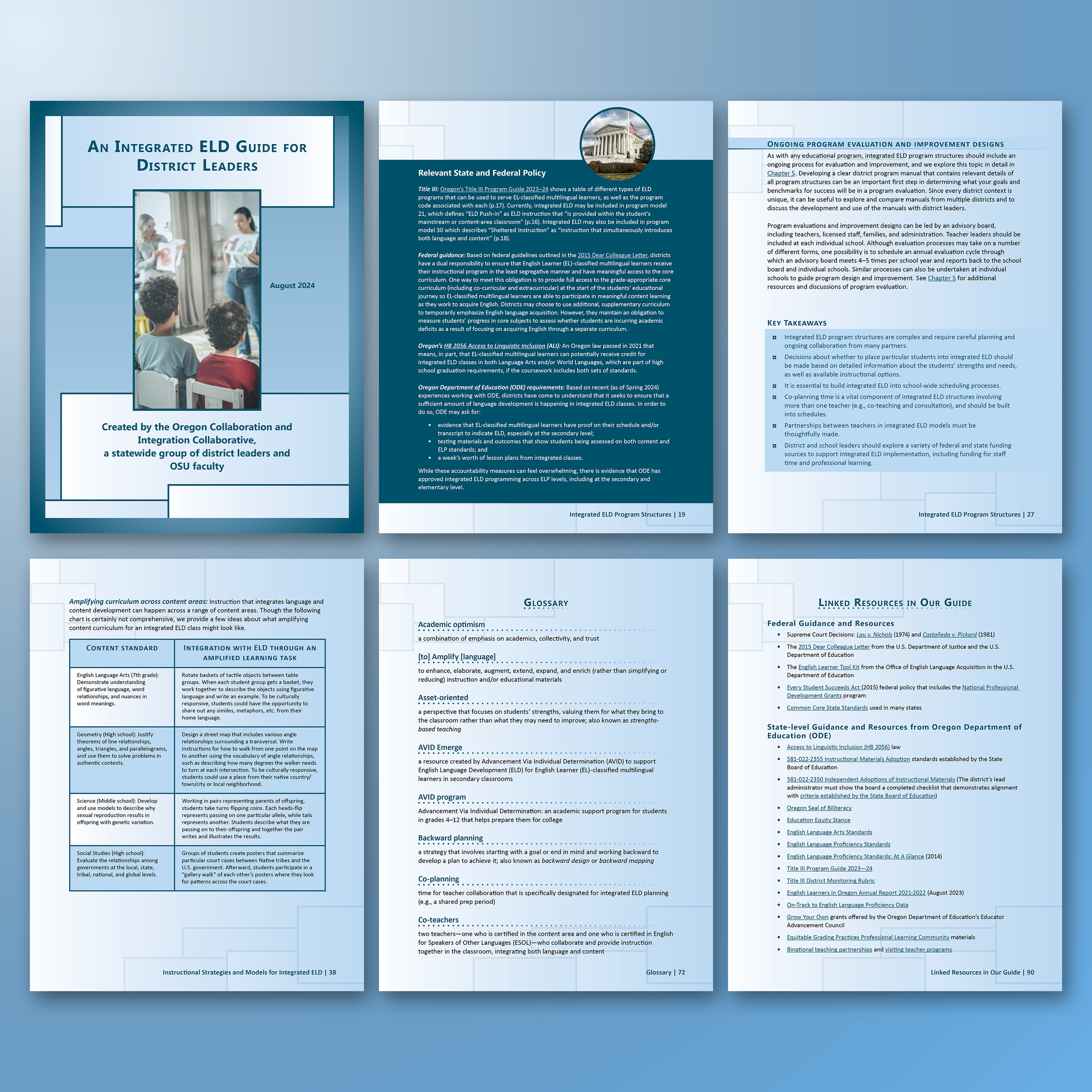
AN INTEGRATED ELD GUIDE FOR DISTRICT LEADERS. An English Language Development guide I designed for The Oregon Education Department. A challenging project, but one that taught me a lot about how to organize complex information and ensuring Section 508 accessibility compliance.
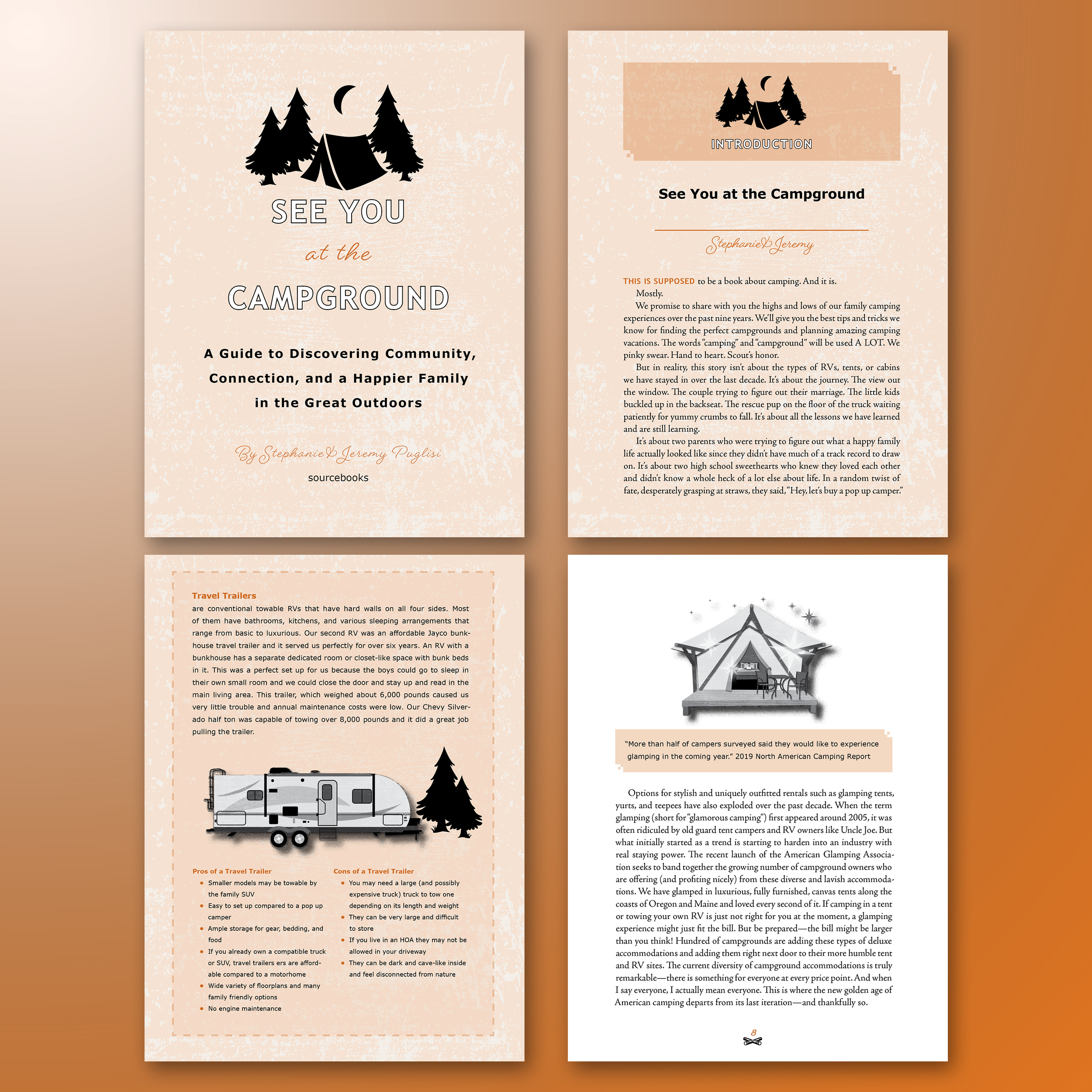
SEE YOU AT THE CAMPGROUND. Non-fiction, but told more like a memoir rather than a guide. While it was full of reference figures and detailed information, it needed to feel more personal and not just technical.
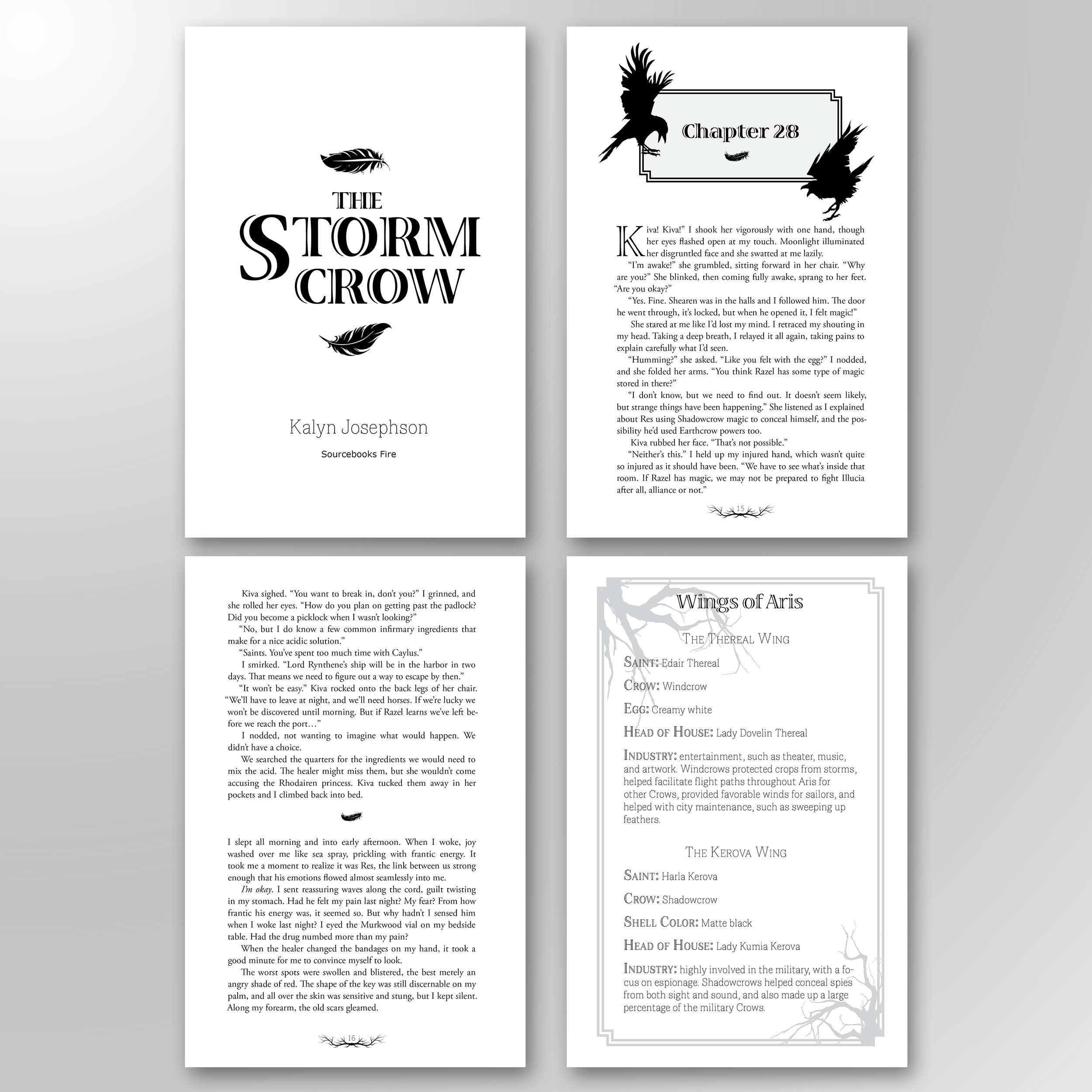
THE STORM CROW. An interior design I created for a fantasy project by Sourcebooks that required visual congruence with the cover, along with added elegance and flair.
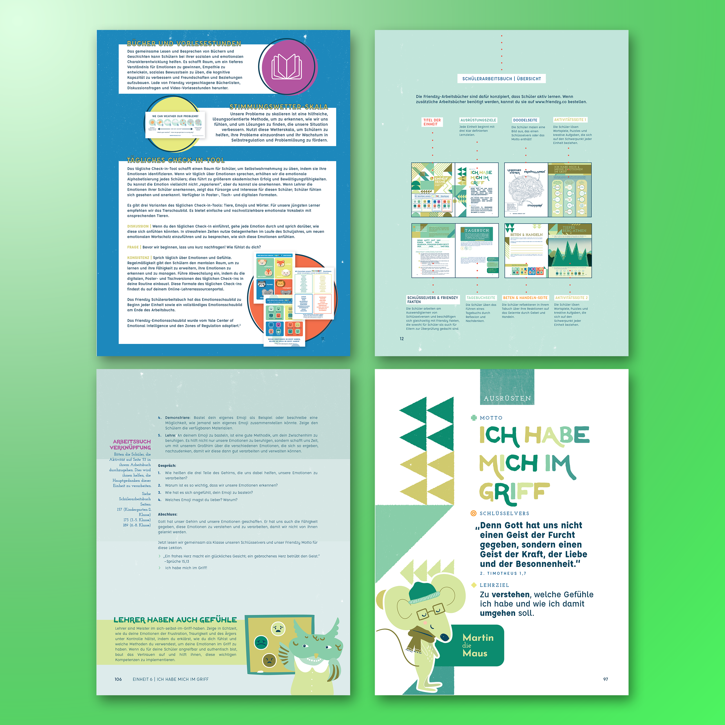
FRIENDZY CHARACTER CURRICULUM (GERMAN EDITION). I don't know German, but I had to learn a little about German typography. A challenging beast, tough to adapt—since German has extremely long words—but especially when working with a strict page count.
FRIENDZY CHARACTER CURRICULUM WORKBOOKS (SPANISH EDITION). I started at Friendzy as a curriculum translator, but also graphically adapted all of Friendzy’s Spanish supplemental content. The pages shown here are from Friendzy's K-8 student workbooks, full of activities and games, very colorful and friendly.
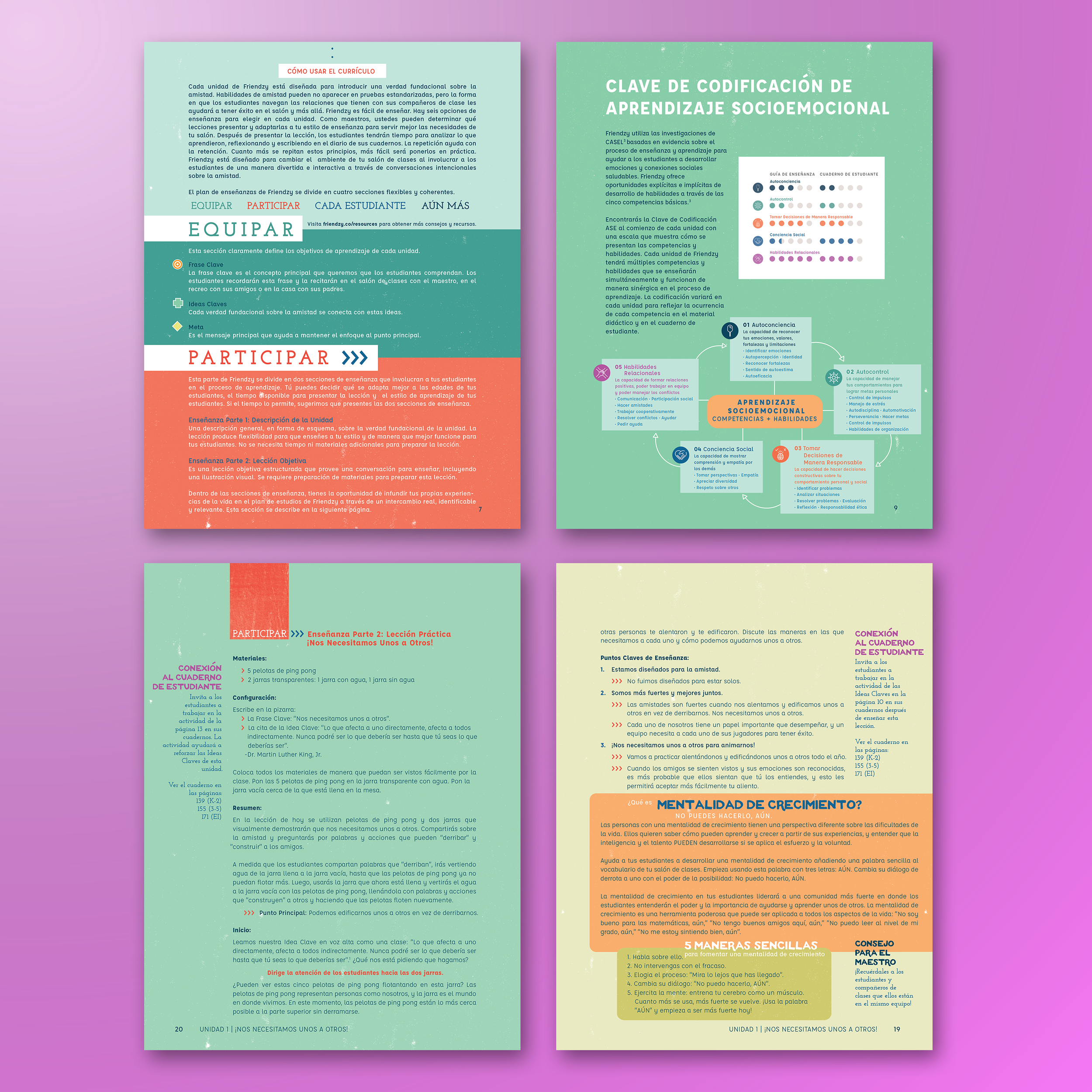
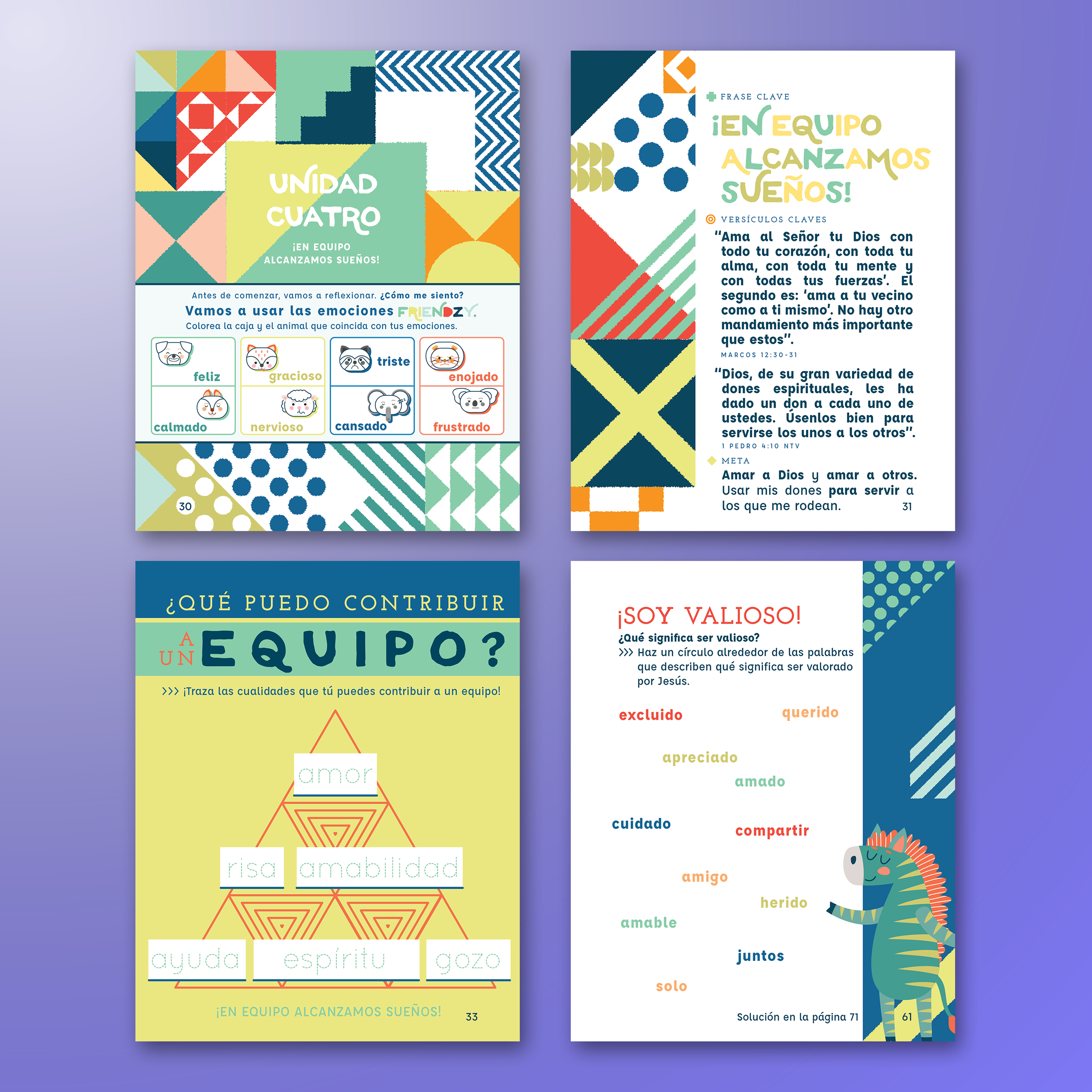
FRIENDZY CHARACTER CURRICULUM TEACHING GUIDES (SPANISH EDITION). My main body of work with Friendzy as a lead Spanish translator. I translated and designed all of the Spanish curriculum, and these pages here are from Friendzy's teaching guides, full of activities and games, for teachers to implement.
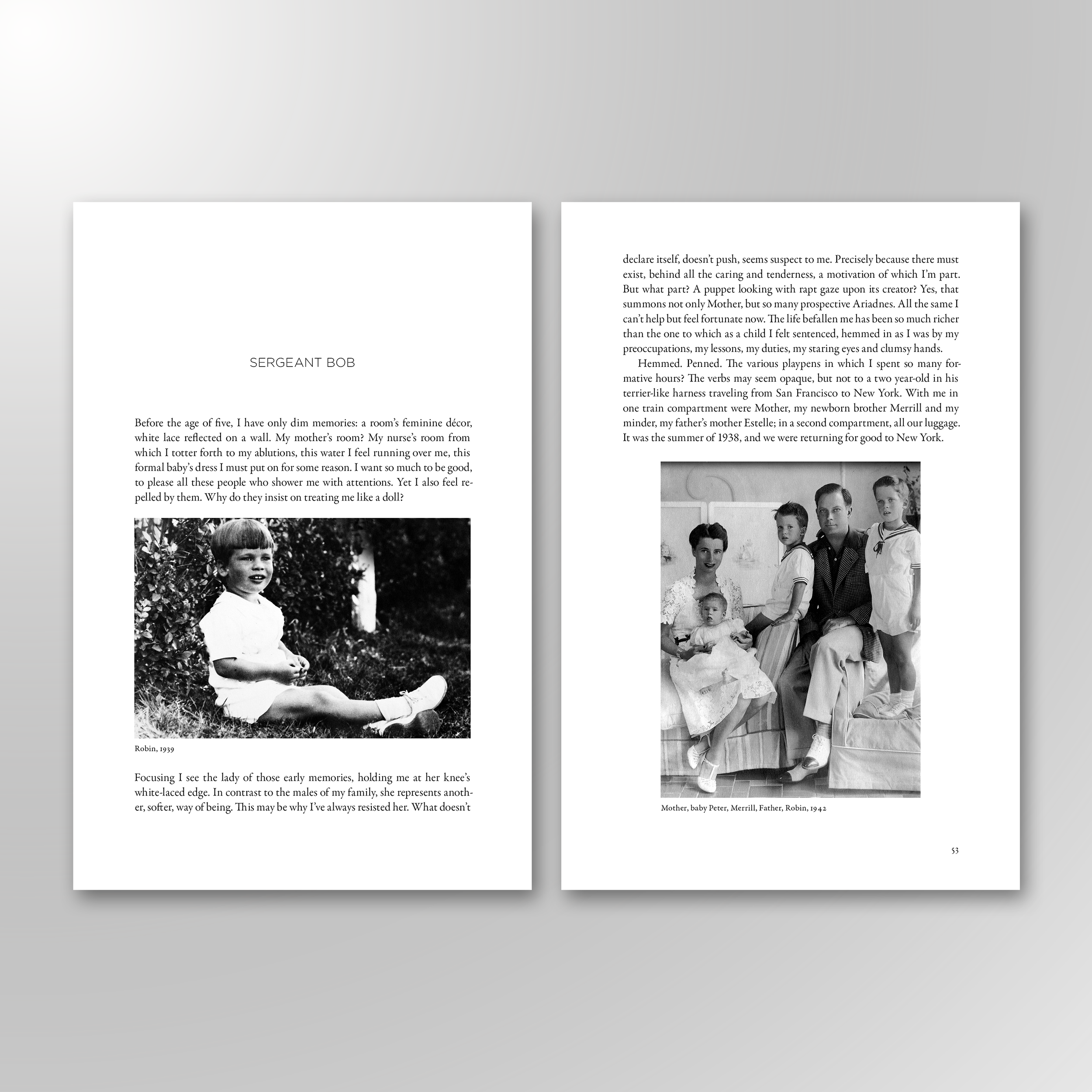
THE MEMOIRS OF A MINOTAUR. Filled with personal and captivating photos. I’m grateful to have laid out the interior and to have been part of the book’s journey in some small way.
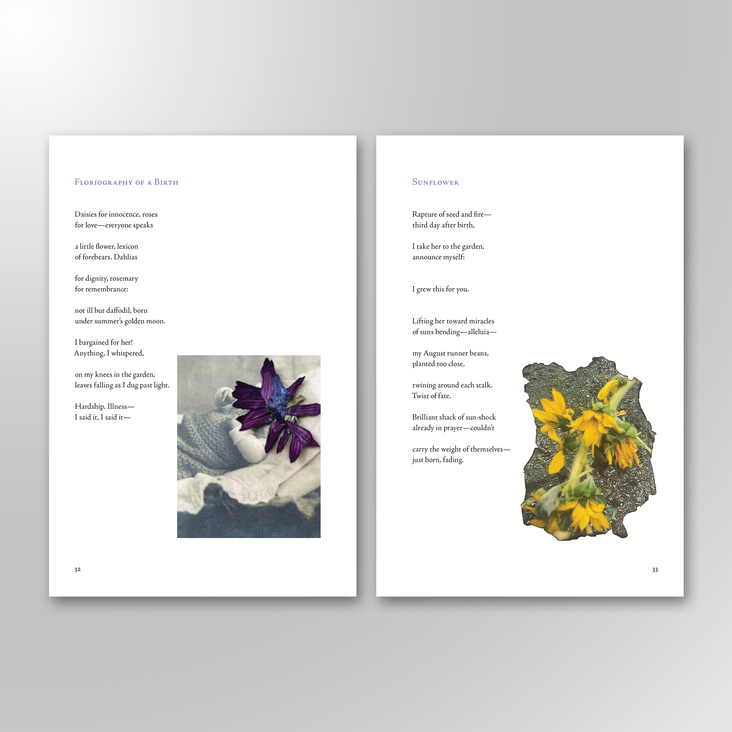
FLORIOGRAPHY CHILD. The interior was truly a pleasure to typset, each poem accompanied by a color photo of a dead flower. It's a unique interior that reflects one of the poet’s many passions.

THE BEARABLE SLANT OF LIGHT. Red Hen primarily focuses on poetry. This was one of my very first poetry layouts, and a very challenging one that needed to keep every poem's original visual integrity.
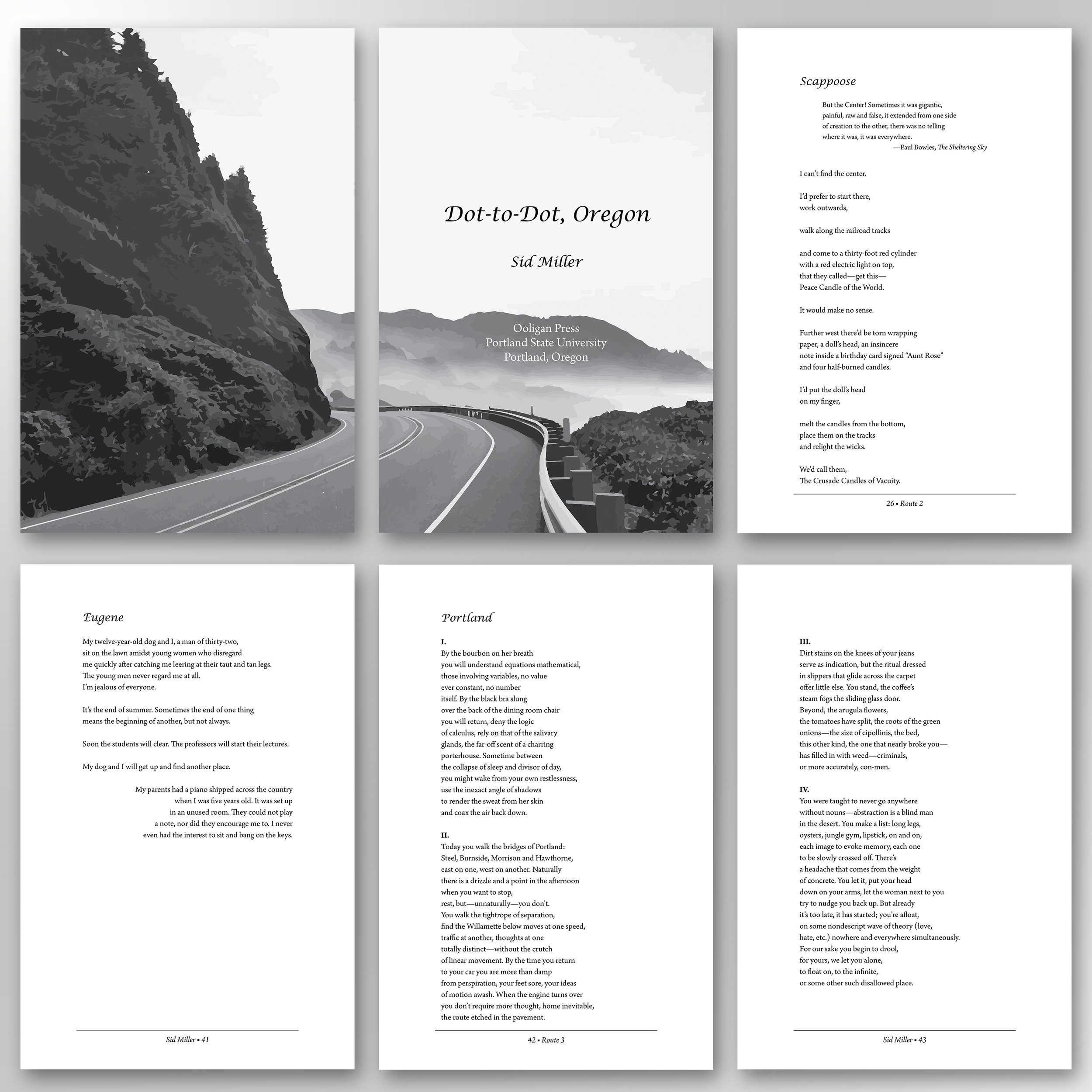
DOT-TO-DOT OREGON. A school project. A travel guide told through poems. One of my first tackles at poetry and a personal favorite of mine since it's about my home state.
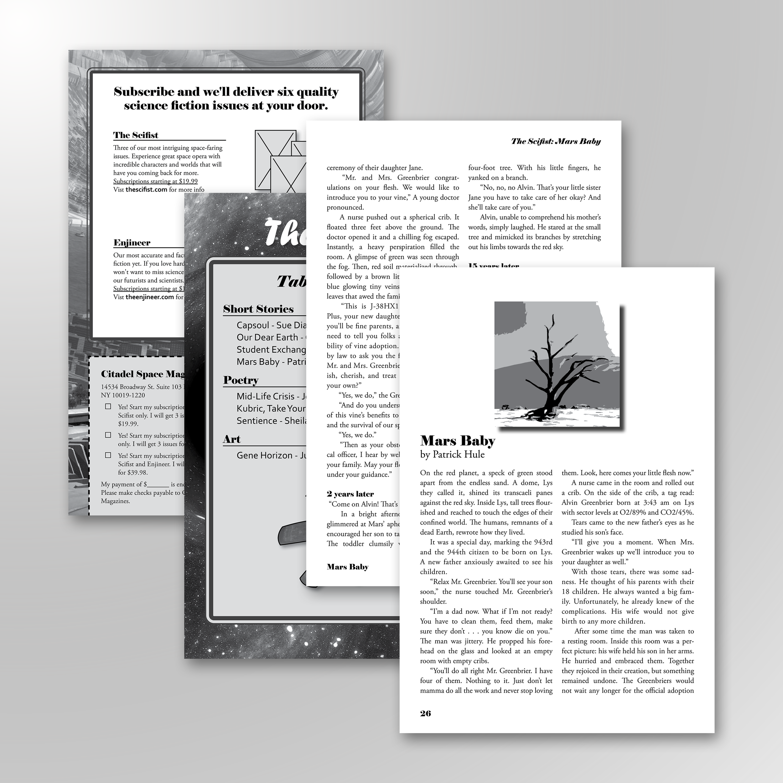
THE SCIFIST. A school project. With this one, I wanted to recreate the iconic "Isaac Asimov's Science Fiction Magazine." I contributed a lot of my own science fiction short stories in order to typset this interior.
THE VOICE OF THIS STONE. A two-column, four-color interior, with various subsections. One of my first school projects that tackled a photo-heavy interior.