Book Covers
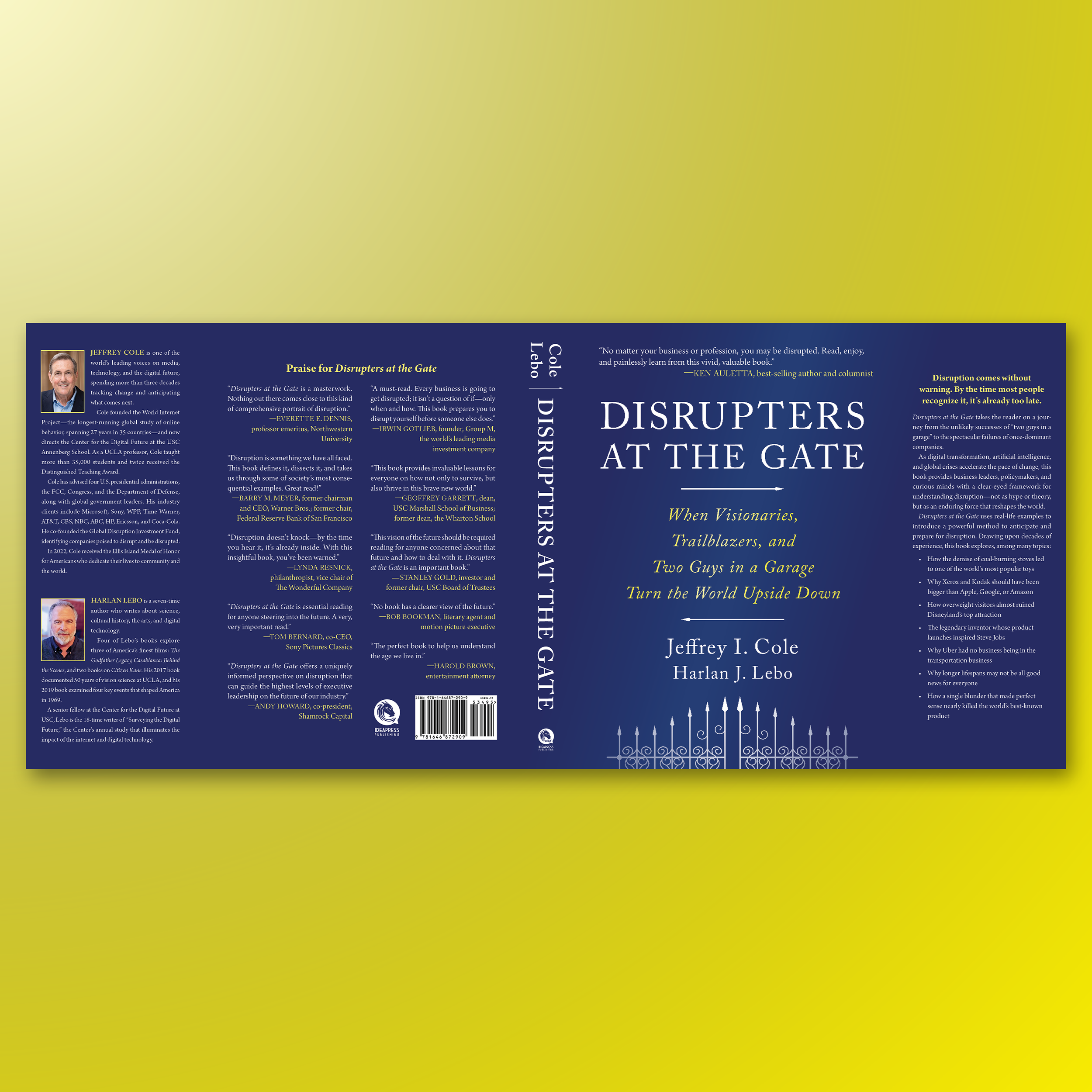
DISRUPTERS AT THE GATE. A massive 464-page non-fiction book written by two extraordinary authors, Jeffrey Cole and Harlan Lebo. The cover is mostly typographical, uses a traditional Caslon typeface, and features an illustration of a fanciful gate. One of the challenges was fitting all the endorsements this incredible book received.
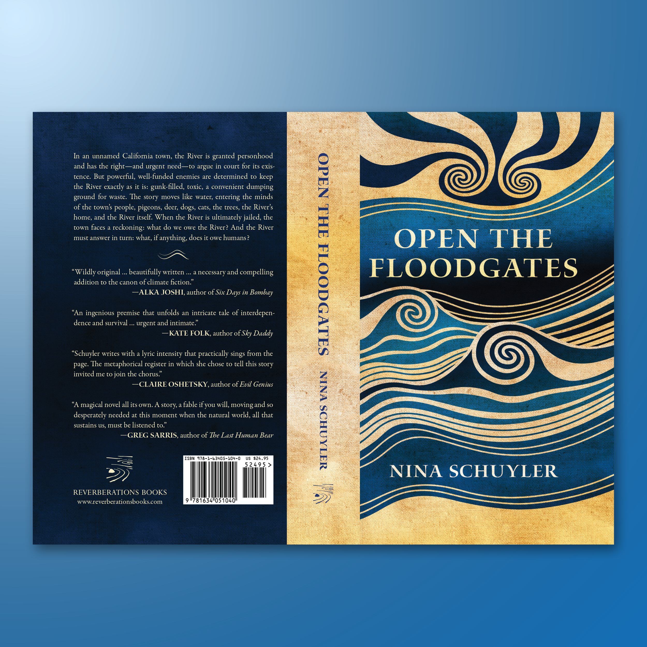
OPEN THE FLOODGATES. A wonderfully experimental novel by Nina Schuyler. The cover art was custom-made in Illustrator and took many iterations for me to perfect. I am truly proud of this one, and can't wait for the world to read about the sentient river.
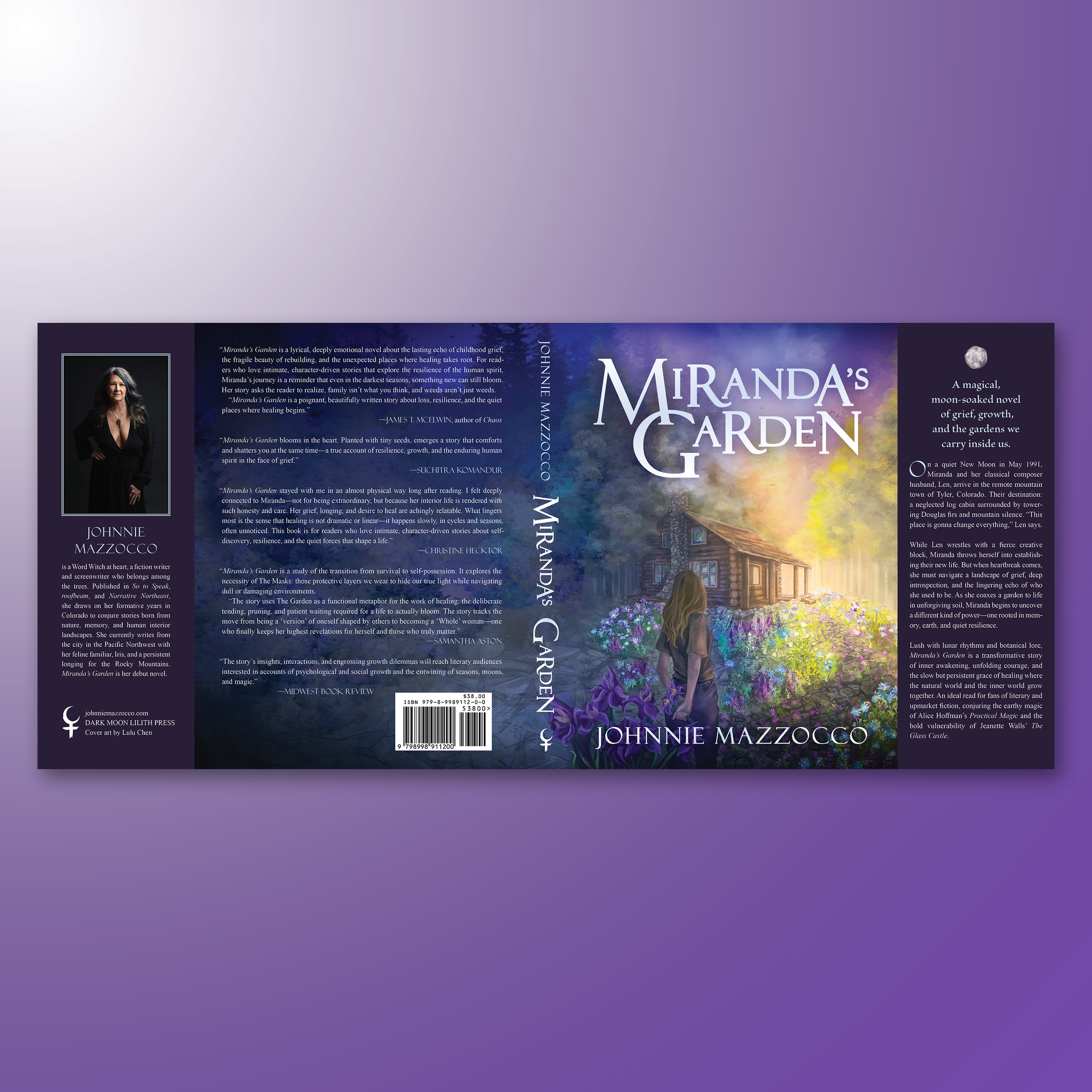
MIRANDA'S GARDEN. A wonderful work of literary fiction with a bit of magical realism. The cover illustration was illustrated by incredible artist, Lulu Chen. I was in charge of designing the rest of the book's mechanical, and worked with the artwork to make it shine with engaging, clean typography.
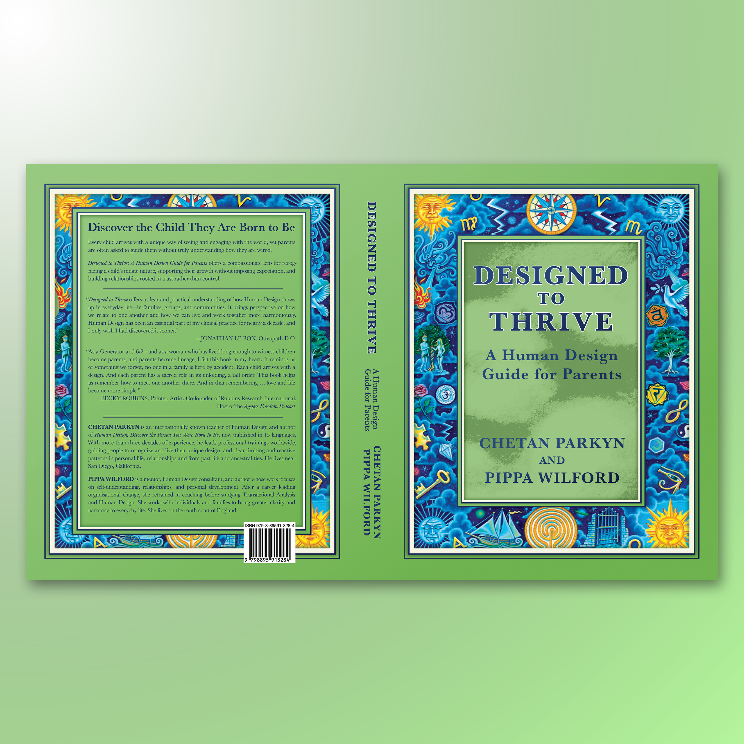
DESIGNED TO THRIVE. I worked closely with the authors to design the next iteration of Human Design, a renowned self-help book published in 2009. I kept this design faithful to its previous counterpart by making use of the original illustration and accenting this 8 x 10 with a spring green.
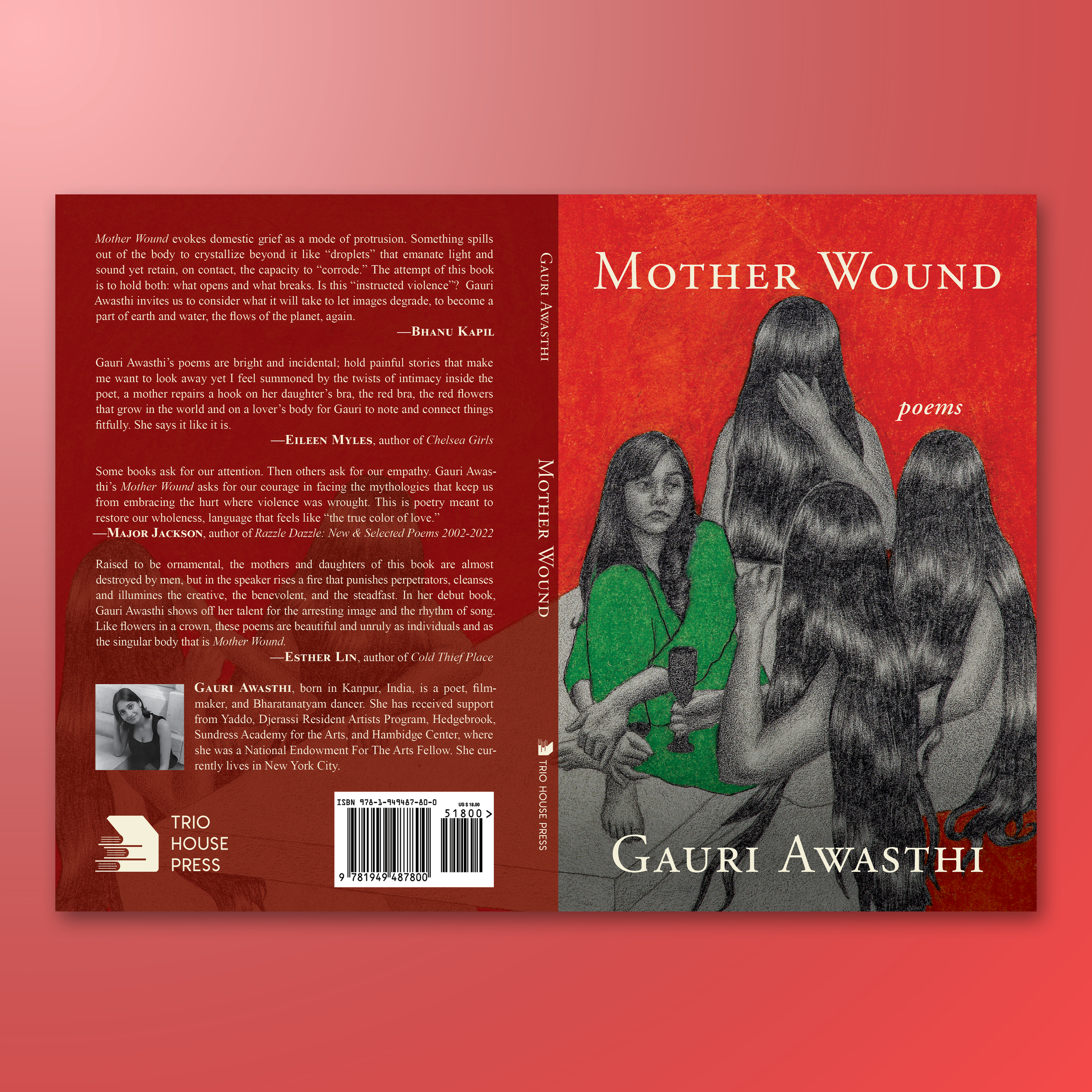
MOTHER WOUND. My first cover work with Trio House Press. A debut poetry collection by filmmaker Gauri Awasthi. I worked with the incredible artwork of Pakistani visual artist Fatima Kaleem Khan to design this gorgeous cover mechanical.
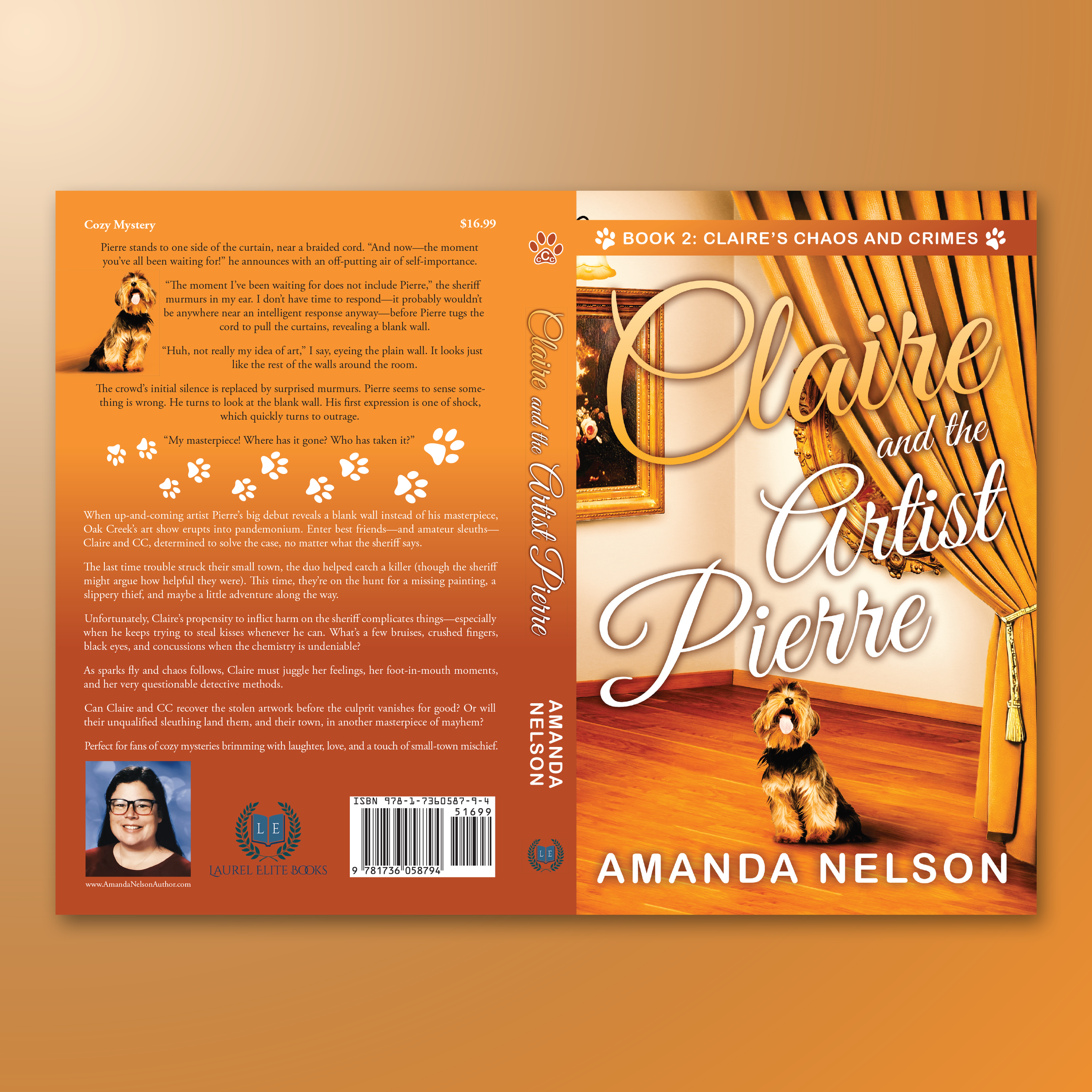
CLAIRE AND THE ARTIST PIERRE. Book 2 in Amanda Nelson’s Claire's Chaos and Crimes series. The cover needed to clearly signal “cozy mystery” while maintaining the same type of dog and overall feel as Amanda’s first book. We explored many concepts, including several illustrated versions, but ultimately, Laurel Elite Books chose a more realistic approach to align with the first book's look and tone.
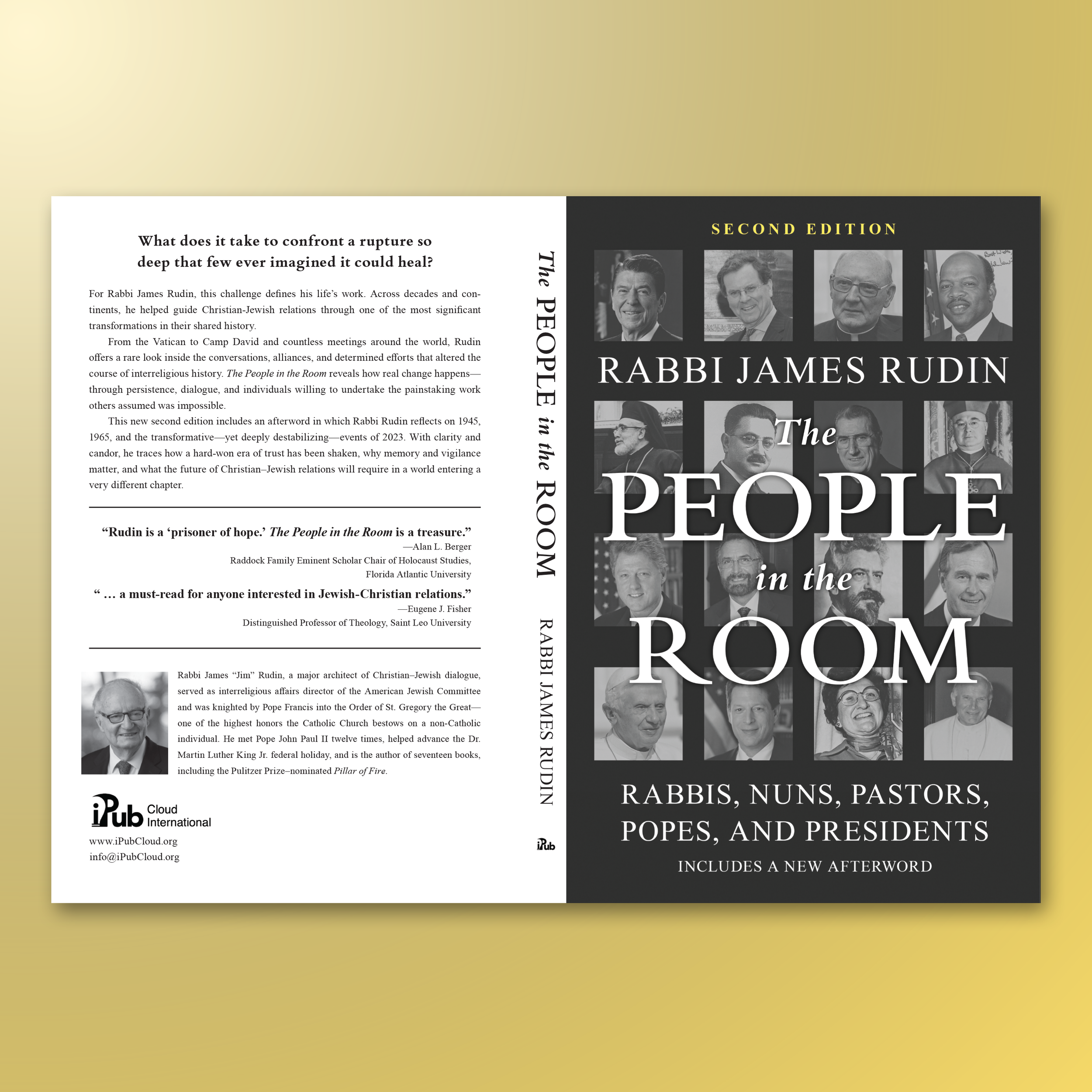
THE PEOPLE IN THE ROOM. A book I designed at iPub, which took a great deal to get right. Because the author knew so many influential people throughout his life, we wanted the cover to reflect as many of them as possible while still maintaining strong title readability and clear typography. After many rounds of iteration, we arrived at an incredible final outcome.
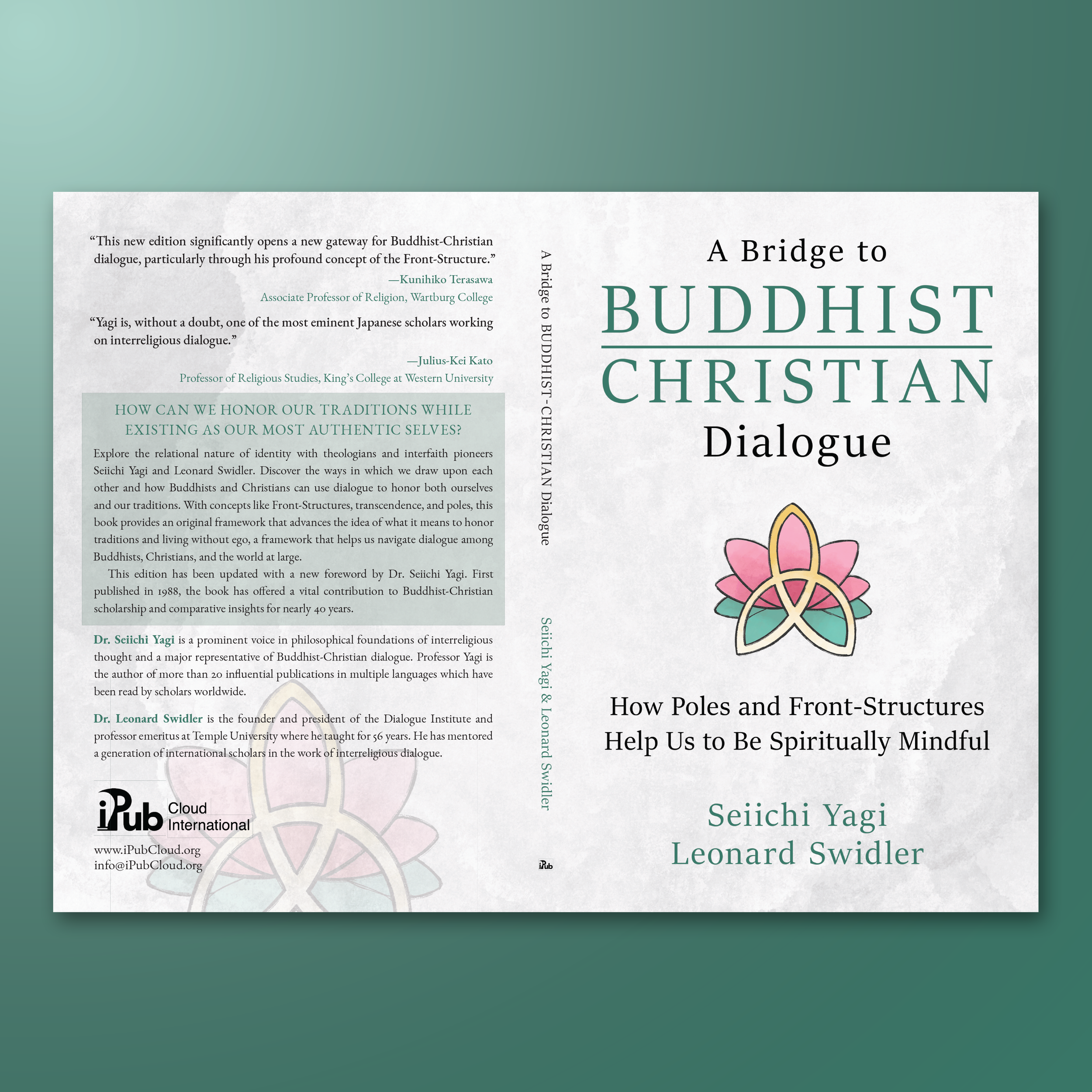
A BRIDGE TO BUDDHIST-CHRISTIAN DIALOGUE. A deeply philosophical and spiritual book on the nature of religious dialogue published by iPub. The lotus illustration was created by Tori Abuschinow, and I was responsible for complementing it with clean typography and its back cover design.
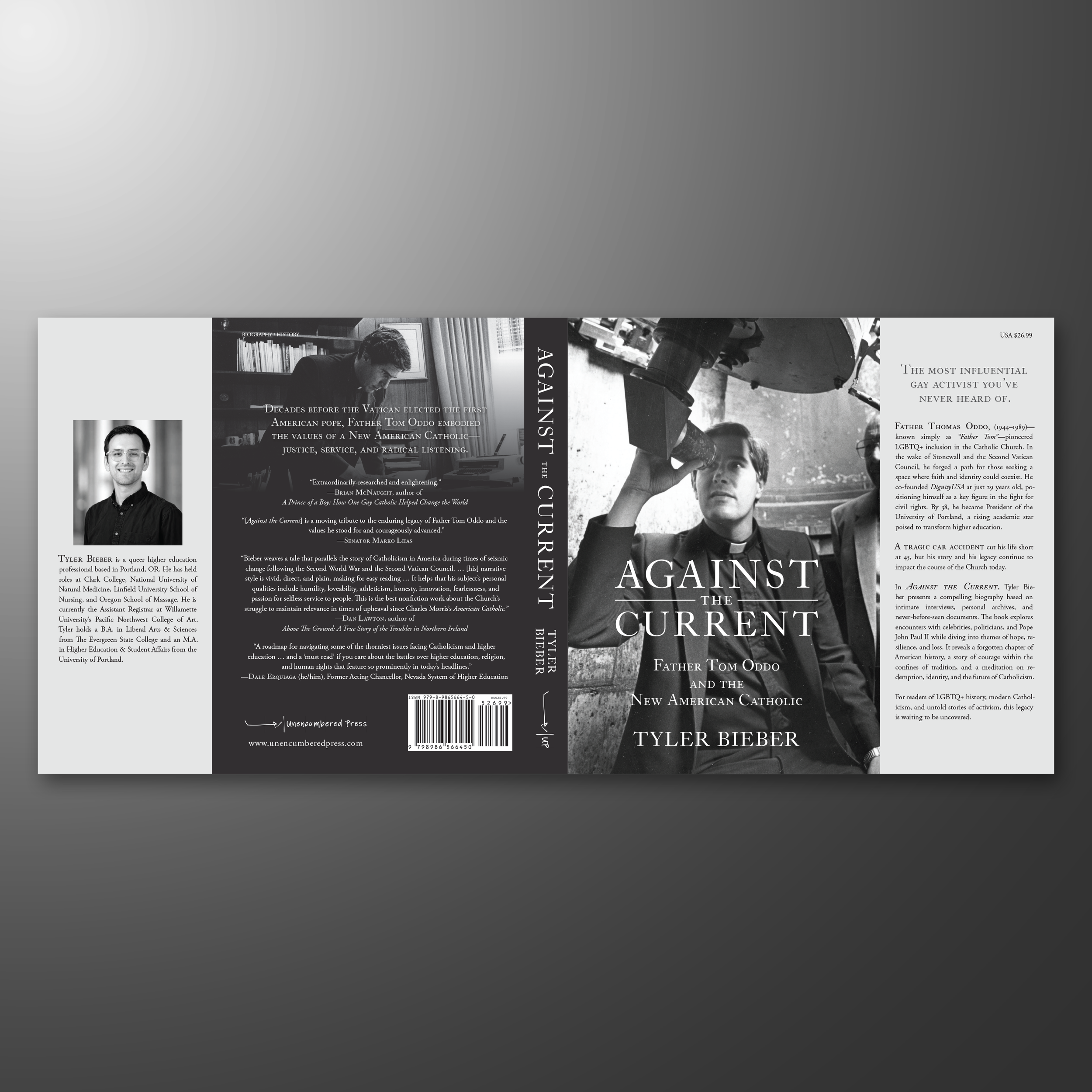
AGAINST THE CURRENT. A full dust jacket that took time and refinement to perfect. The cover design centered on choosing the right photograph of Father Tom, one that could convey the radical reimagining of what it means to be a new kind of Catholic priest. To read more about my cover design process, please visit a blog I wrote for Unencumbered Press about this project: https://unencumberedpress.com/book-publishing/book-design/cover-design-against-the-current/
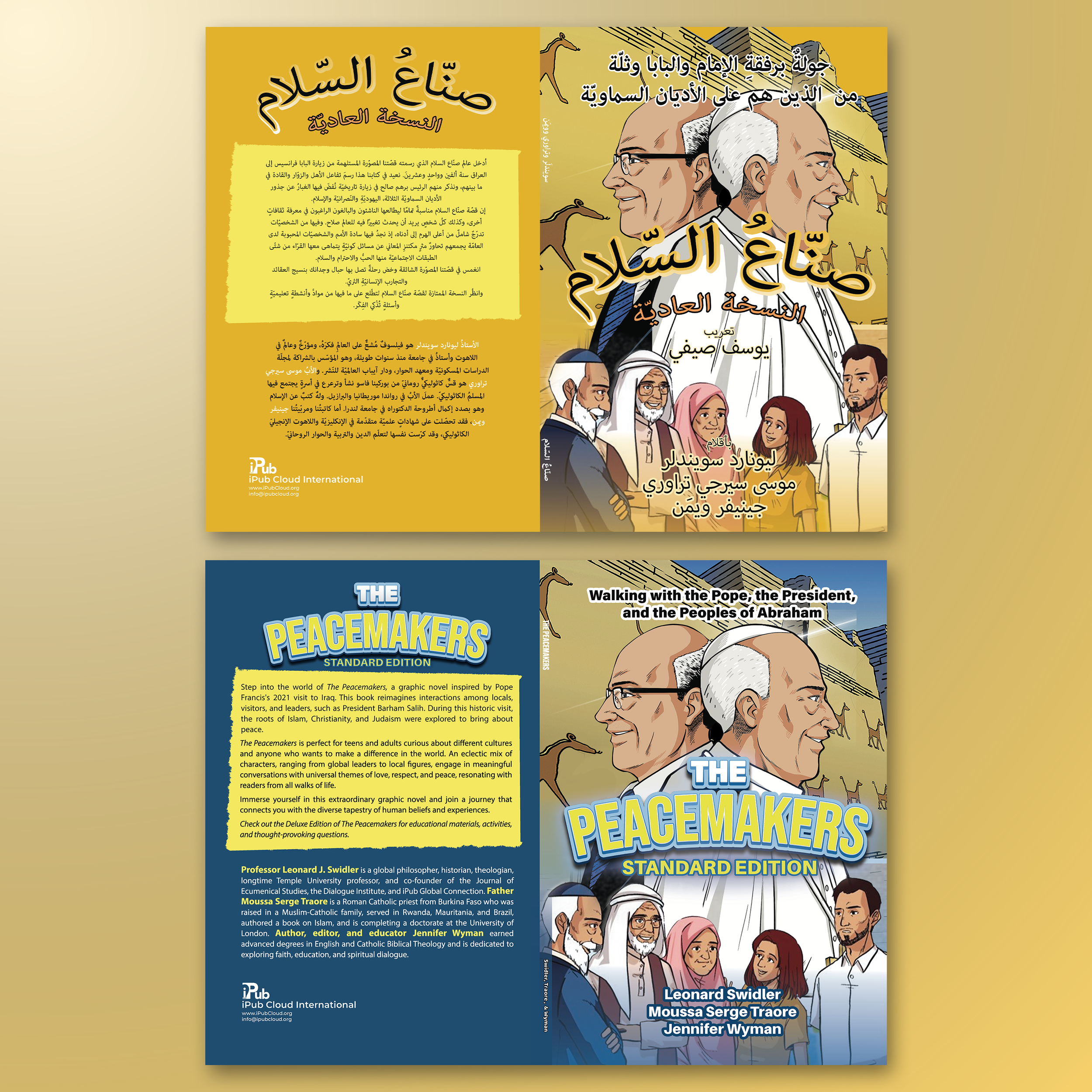
THE PEACEMAKERS (ARABIC EDITION). I had to learn a little about Arabic typography to make this project come to fruition. This comic is being translated into several languages, and each version needs to stay true to the original design. My version is above; the original is below.
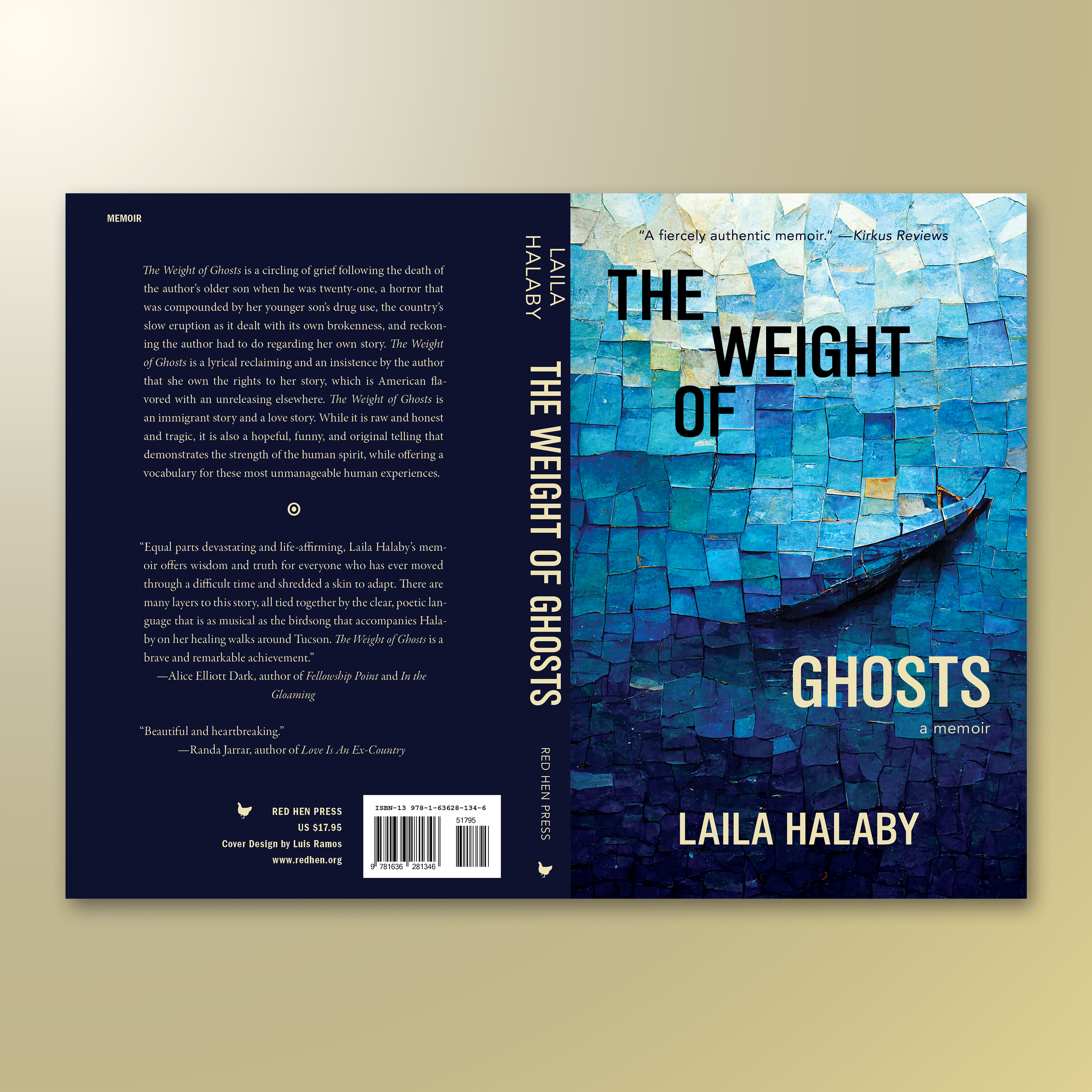
THE WEIGHT OF GHOSTS. Something more abstract for a memoir about grief. There was a lot of collaboration with this project to capture and perfect the tone for this cover. Through a plethora of iterations and feedback, we finally came to something unforgettable.
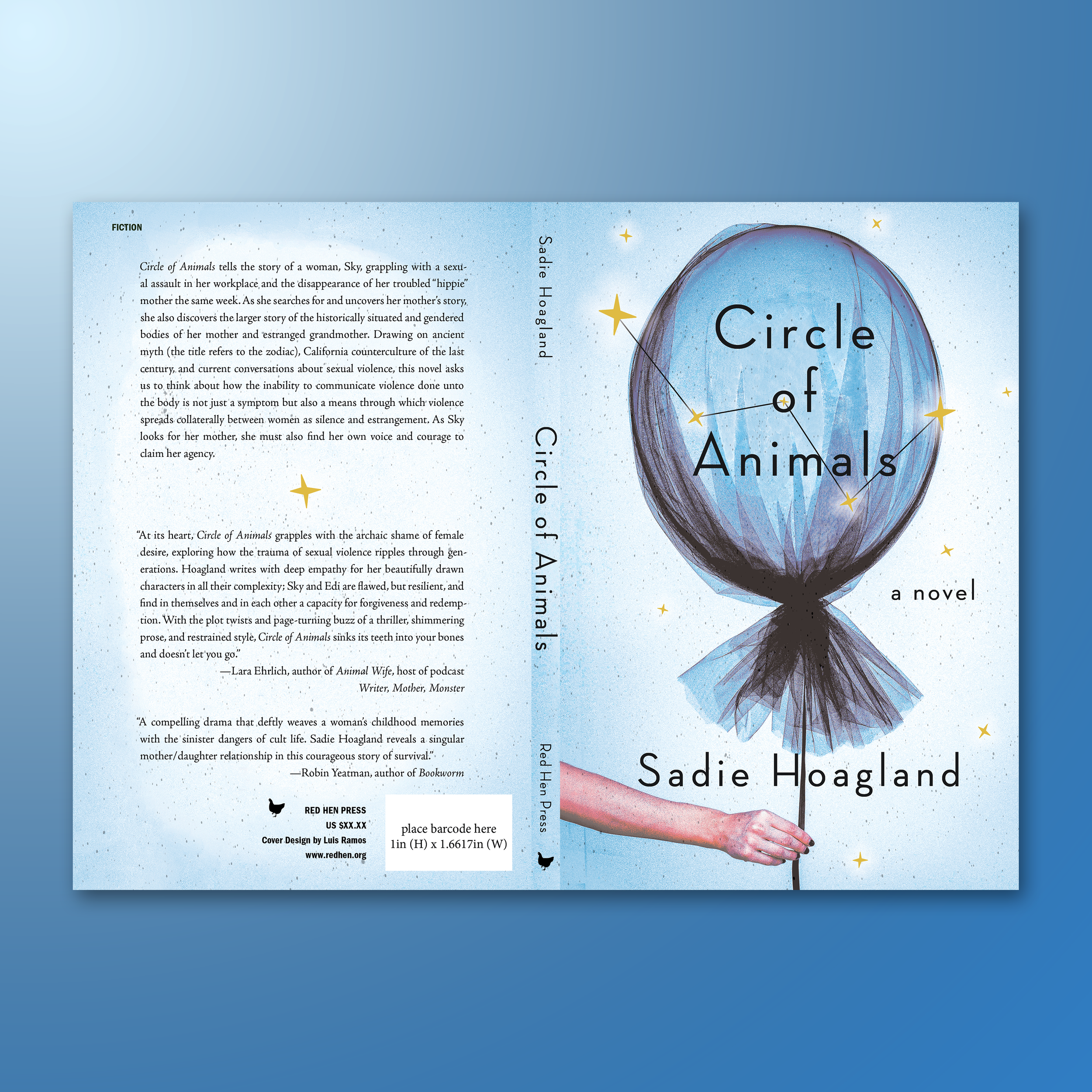
CIRCLE OF ANIMALS. I love this design. Sadly, my design didn’t make it to publication, but I’m still proud of it. While it wasn't the direction RHP was aiming for in the end, I still love showing this off.
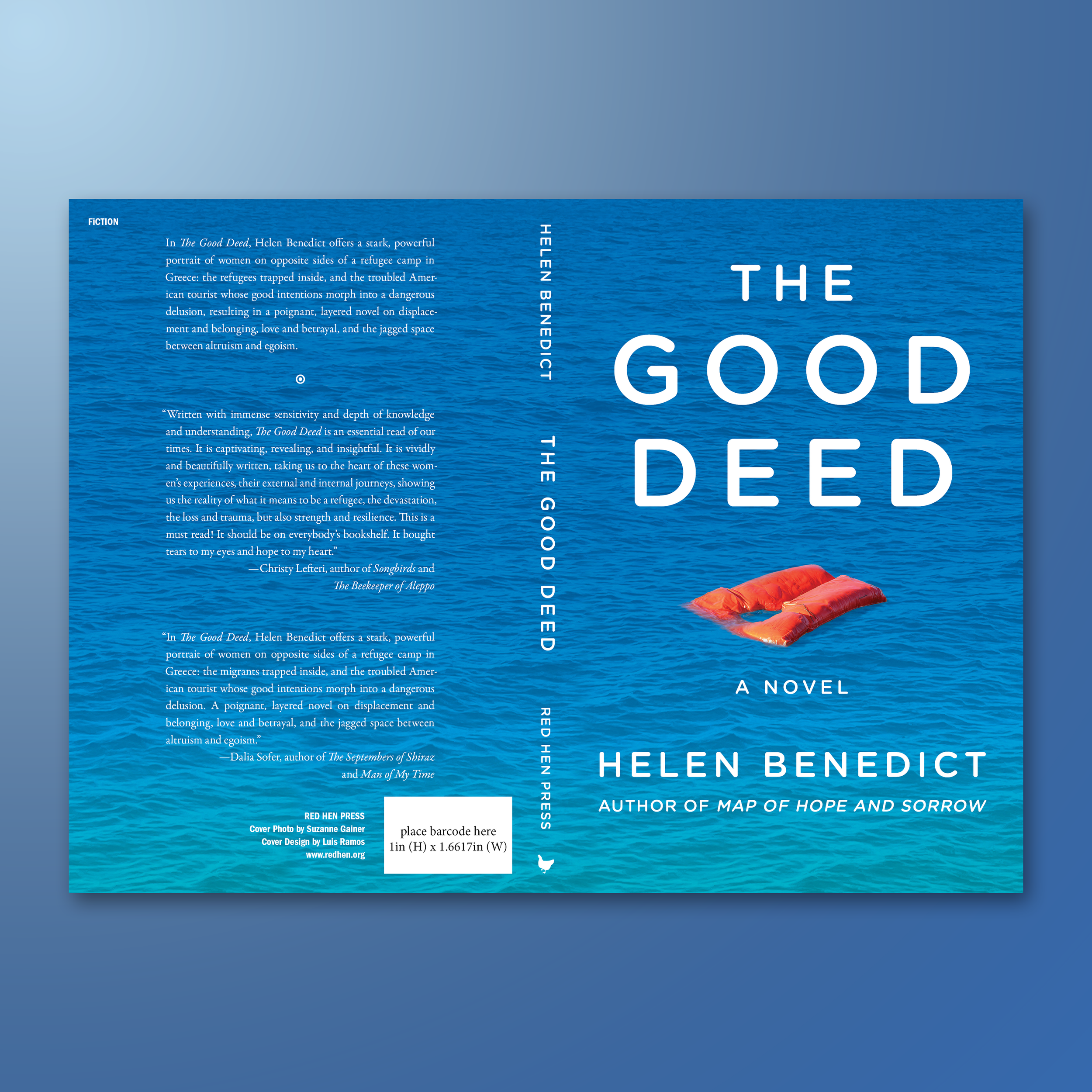
THE GOOD DEED. A thrilling novel about the treacherous journey of refugees. I'm proud to have designed this cover, one of my simpler, yet striking, typographical designs.
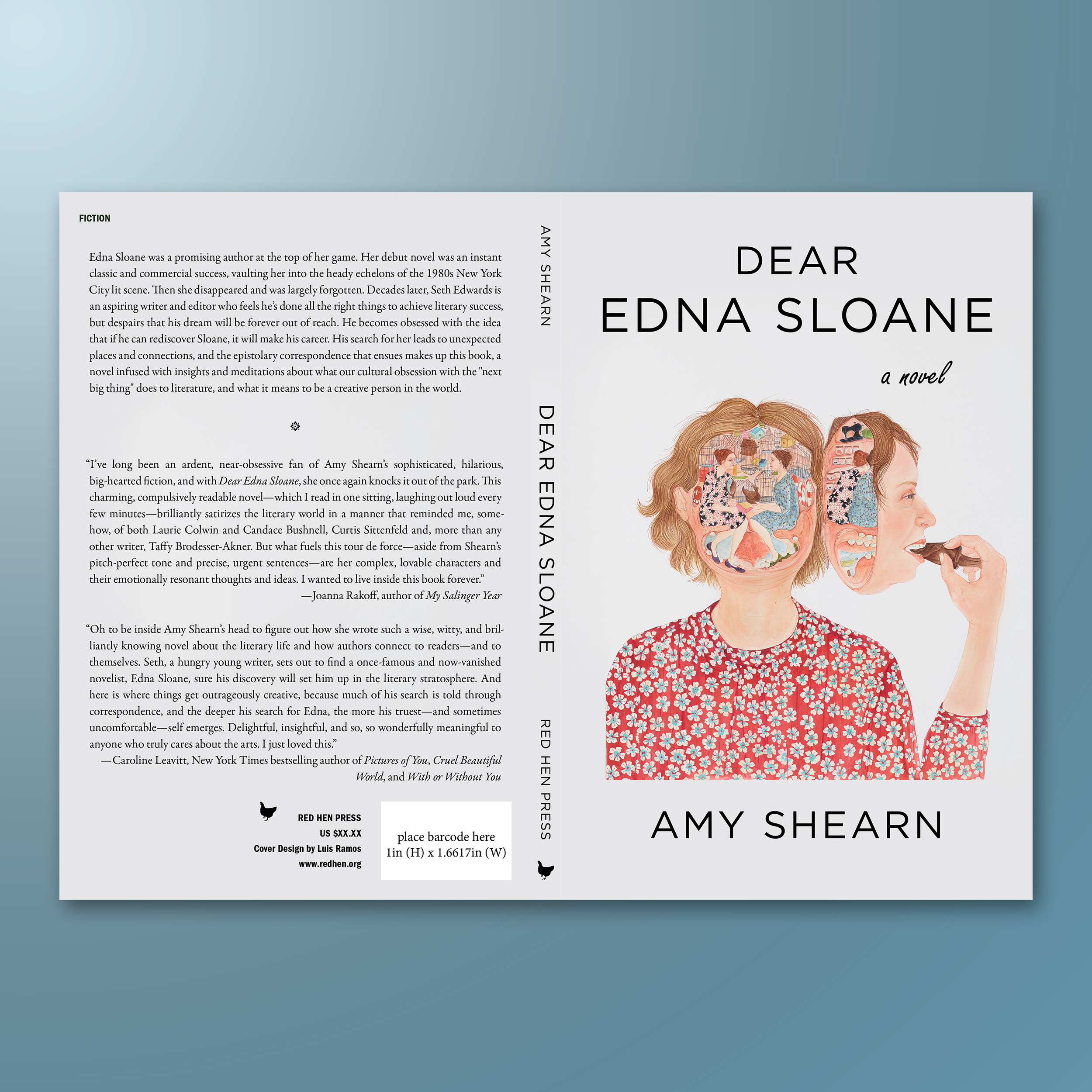
DEAR EDNA SLOANE. Sometimes an artist’s work speaks for itself, and my job is to get out of the way. For this one, I focused on typography and the back cover design that would complement, but not compete with, the incredible art of the illustrator.
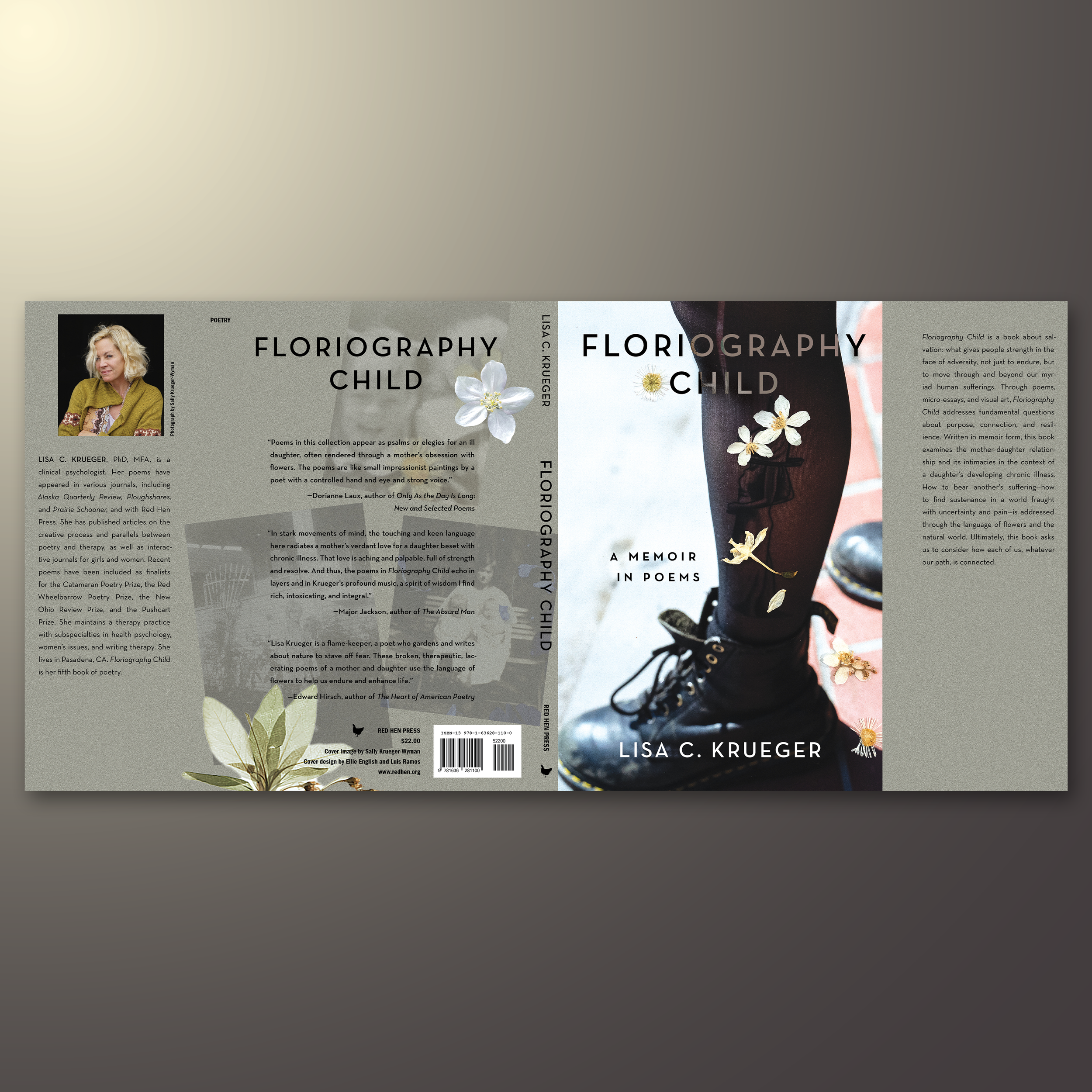
FLORIOGRAPHY CHILD. A memoir told through poetry. A project that required thoughtful attention and close collaboration with the author, especially when it came to incorporating the author's collection of dried flowers into the cover's design.
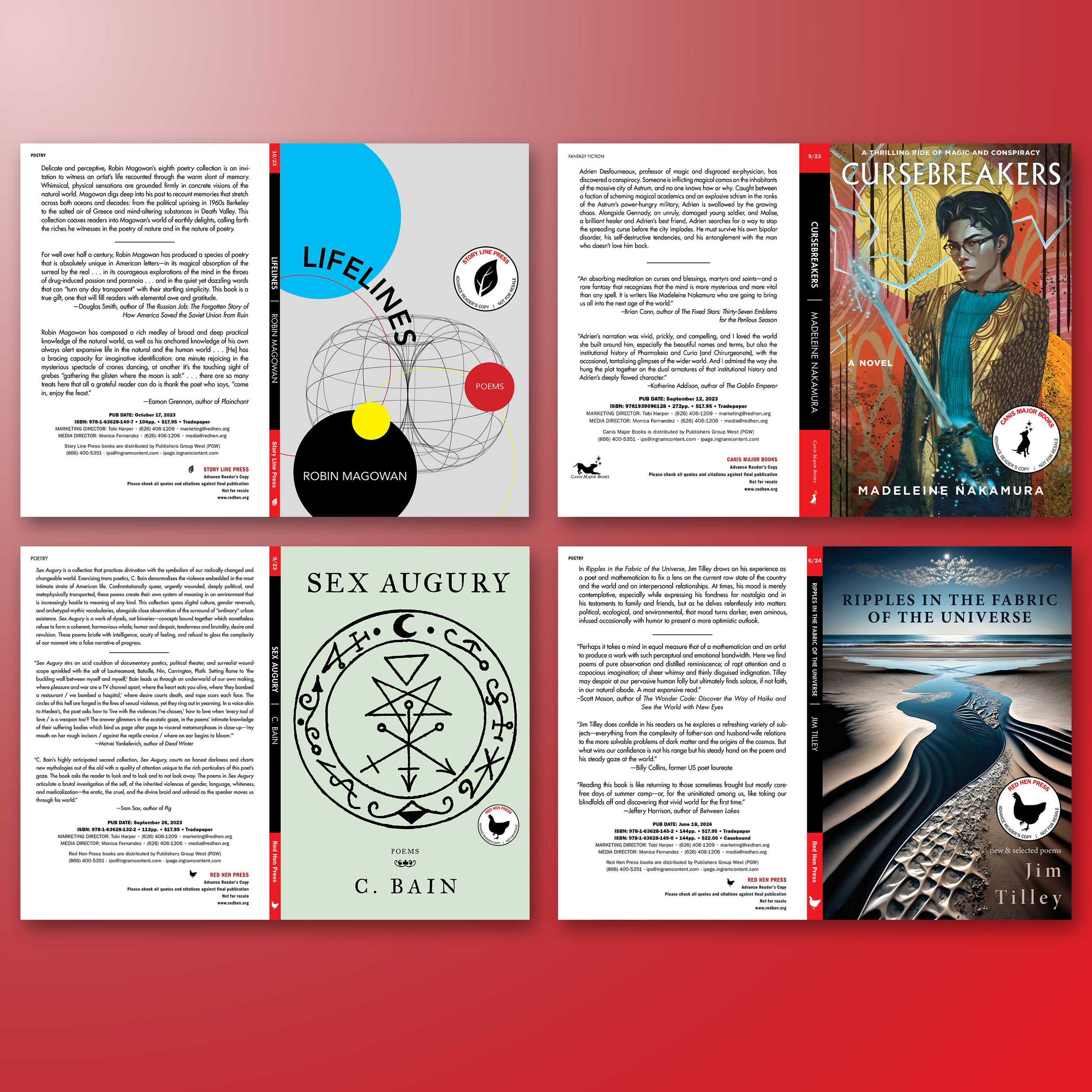
RED HEN PRESS GALLEYS. The covers were created by incredibly talented artists and designers; however, I enjoyed the production work, like creating the galleys in accordance with RHP’s brand guidelines.
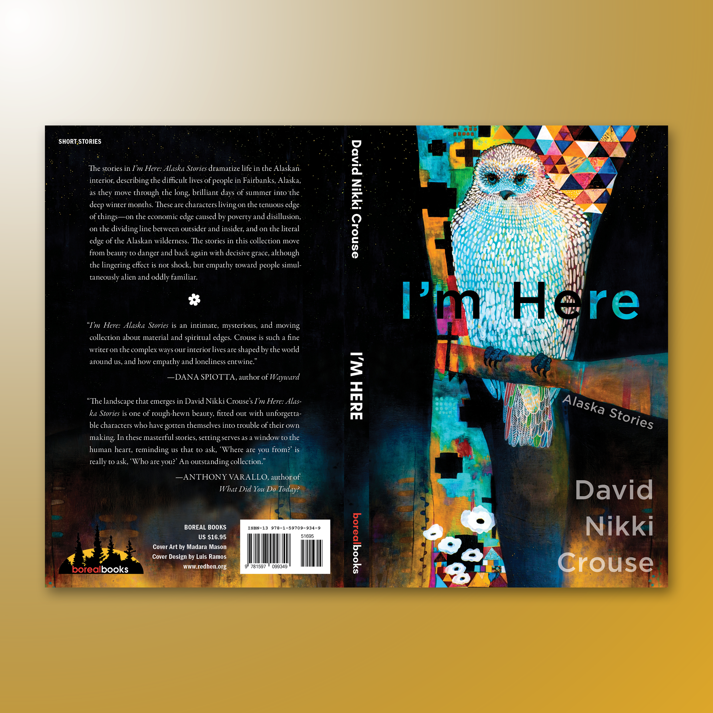
I'M HERE. A short story collection. Really happy with this one. My job was to work with Madura Mason's beautiful illustration and create a mechanical that really complemented the artwork.
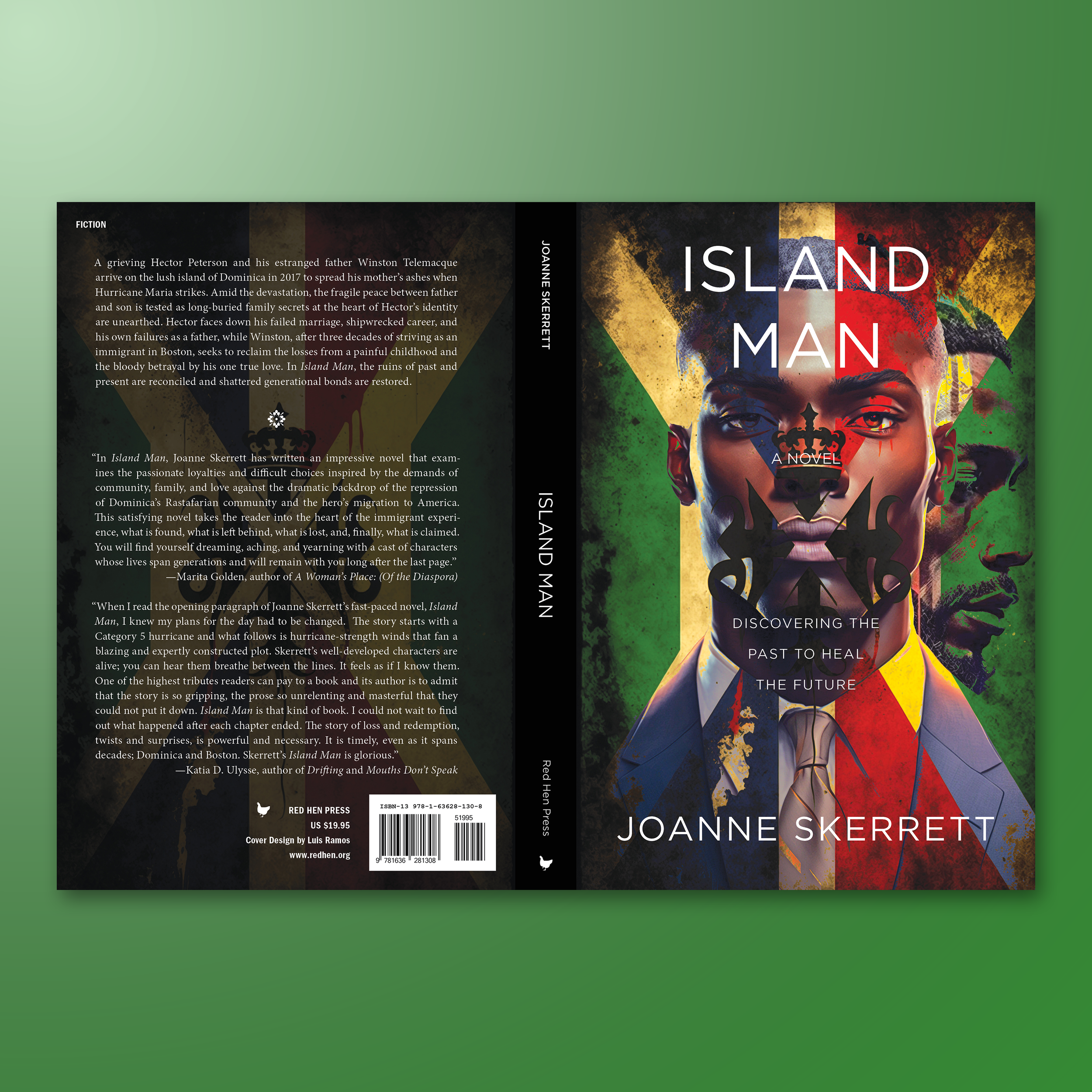
ISLAND MAN. I was provided the illustrations for this one, and it was my job to take all the elements and create something striking. Masking techniques and well-placed typography went a long way.
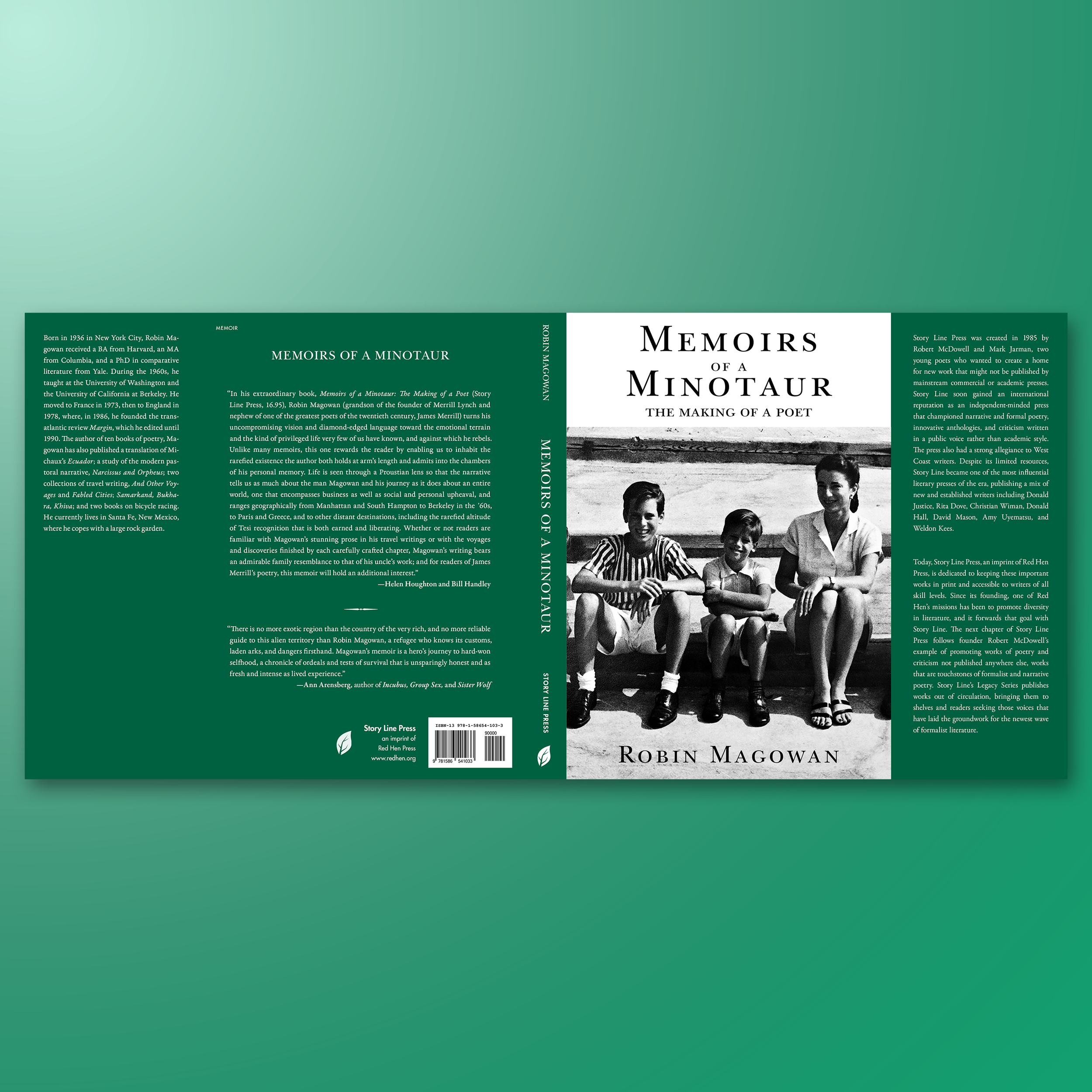
MEMOIRS OF A MINOTAUR. One of the first memoirs I worked on. Among many options, this photo stood out, truly capturing the multi-generational journey at the heart of the story.
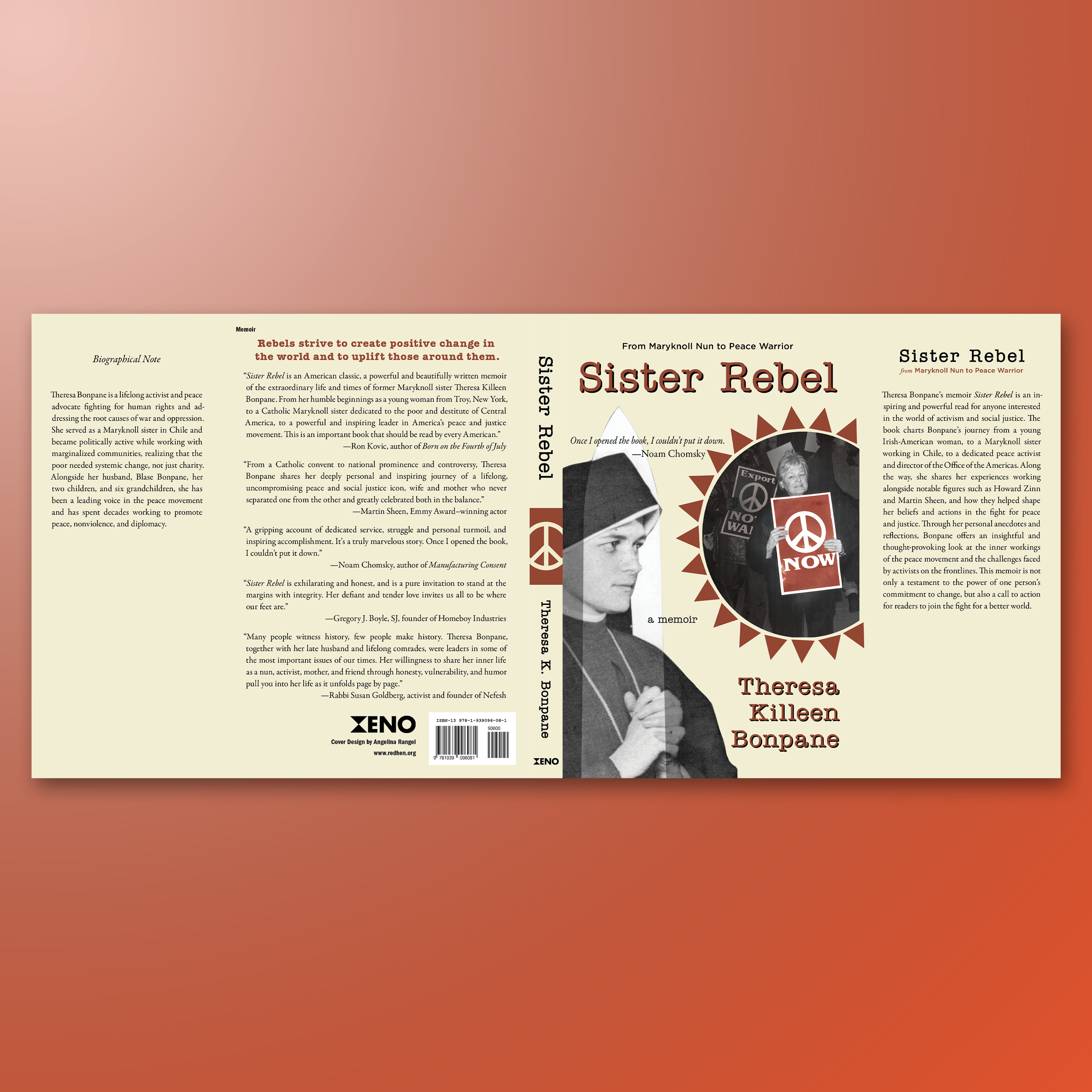
SISTER REBEL. This project involved more production work on my end, perfecting the typography, adjusting the spacing between all the visual elements, and getting the colors just right.
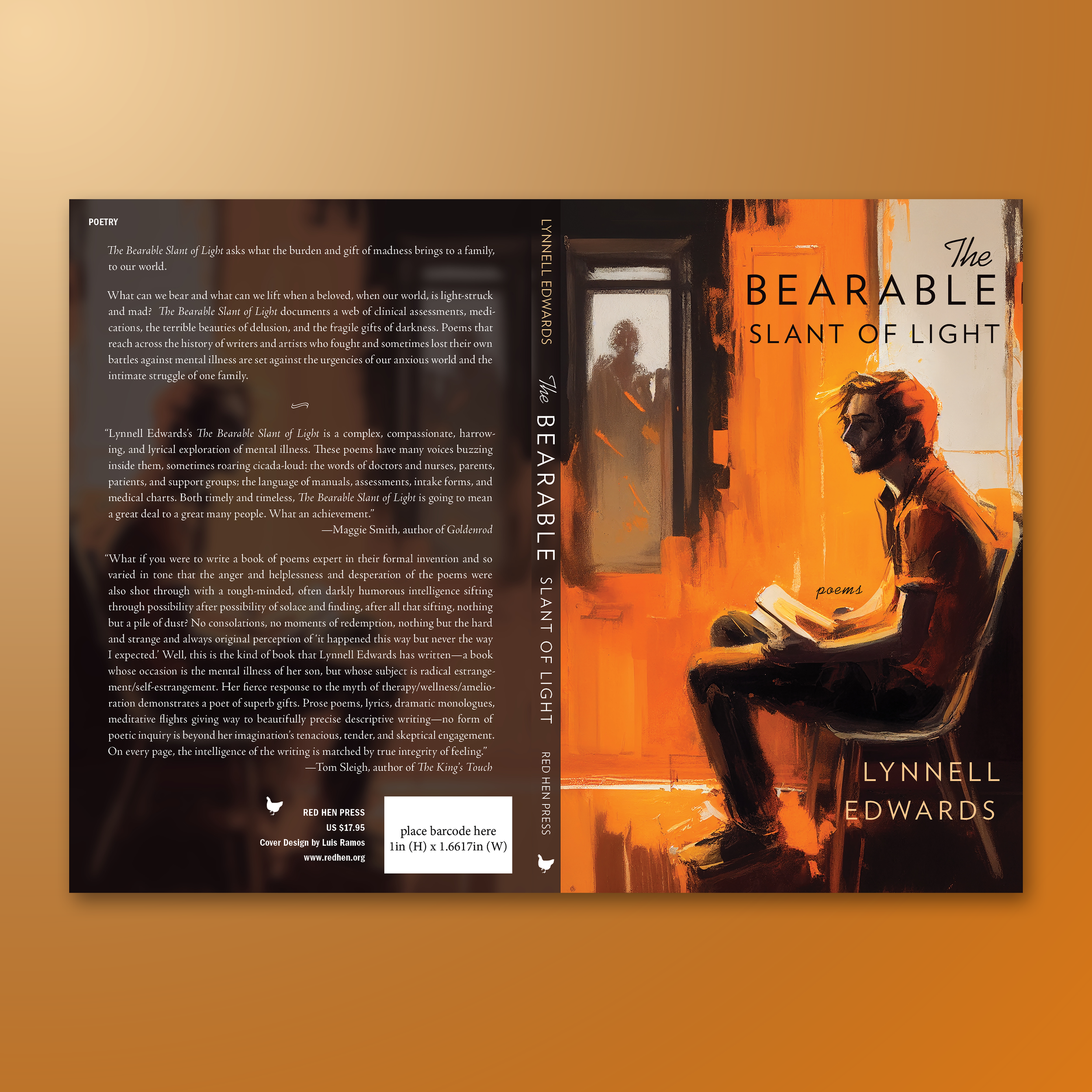
THE BEARABLE SLANT OF LIGHT. I'm not entirely sure who the illustrator was when this cover came my way. My role was to design the jacket and create typography that was both well-placed and visually distinctive.
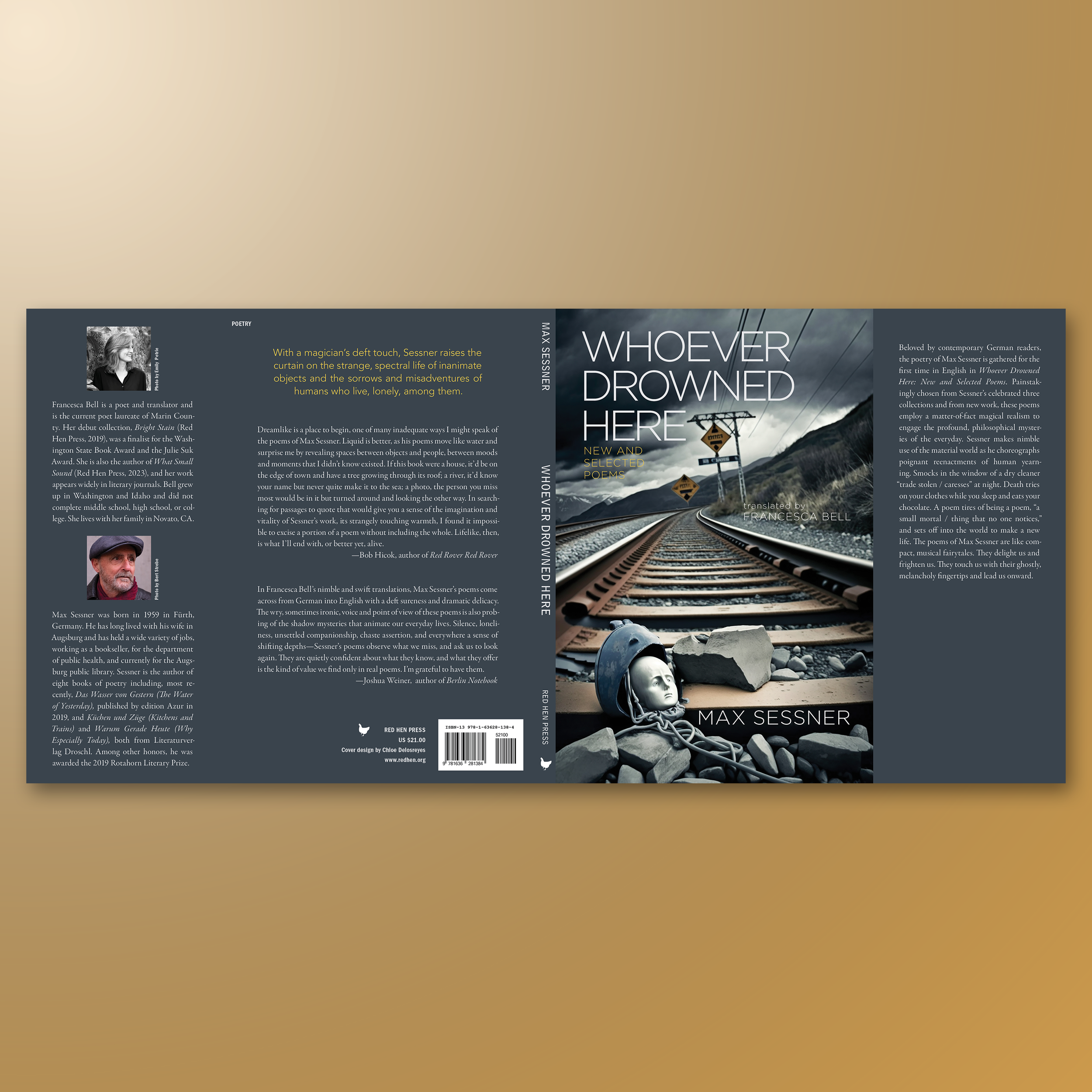
WHOEVER DROWNED HERE. More production work with this project. The challenge part was working with Chloe's design and trying to make the typography really shine. I'm usually a stickler for using drop shadow and try to avoid it whenever possible.
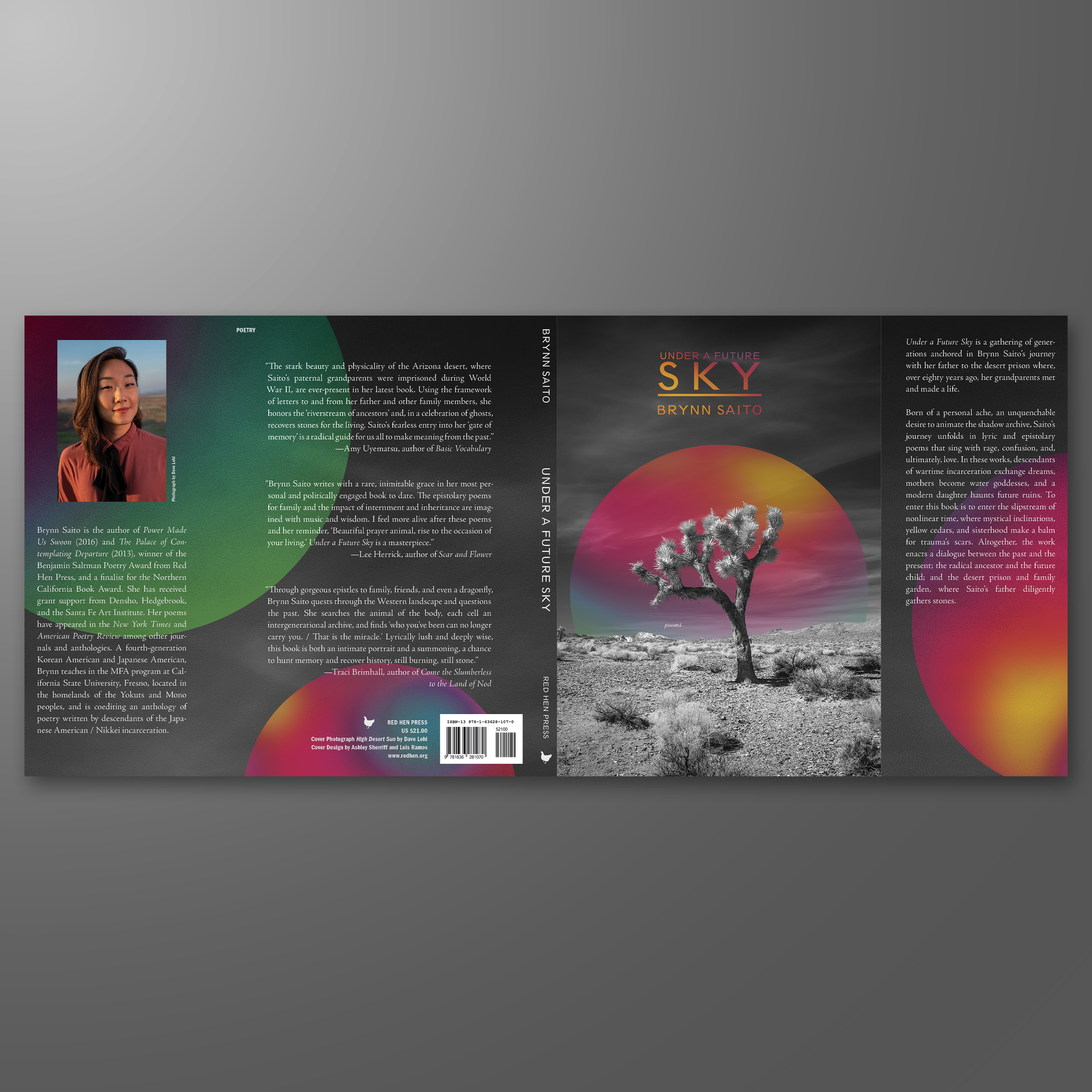
UNDER A FUTURE SKY. A collaboration between me and many other designers. I handled a lot of the production work, which meant getting the typography blocked title just right, and figuring out where to place the word “poems.” That might not seem like much, but it took a surprising amount of thought.
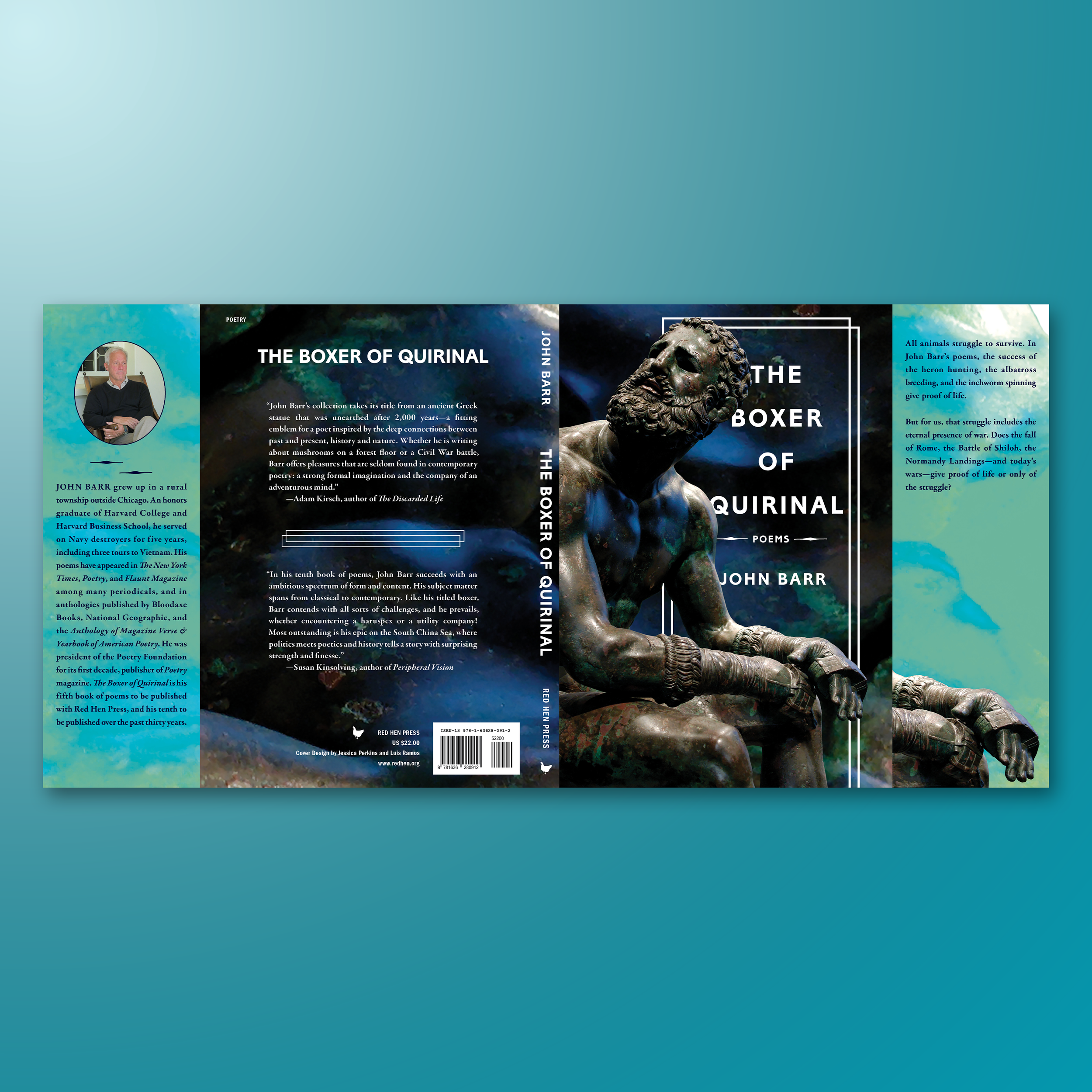
THE BOXER OF QUIRINAL. One of my first dust jackets at RHP. It took a keen eye to create a dust jacket that complemented the cover's front cover. Loved how this turned out.
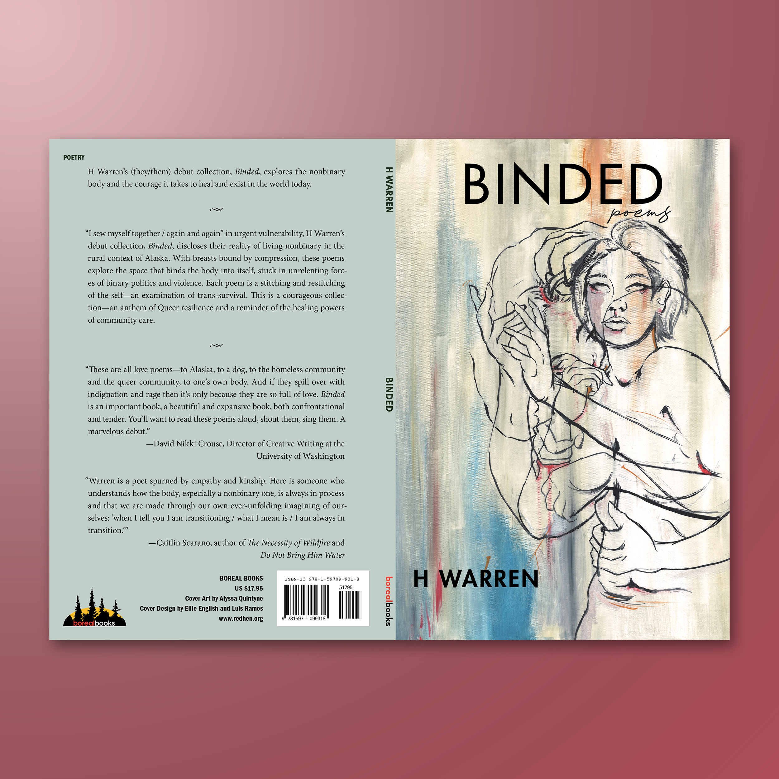
BINDED. One of my first major projects at RHP. Worked with many artists and designers to create sunning designs. This one involved many collaborators to make something truly special.
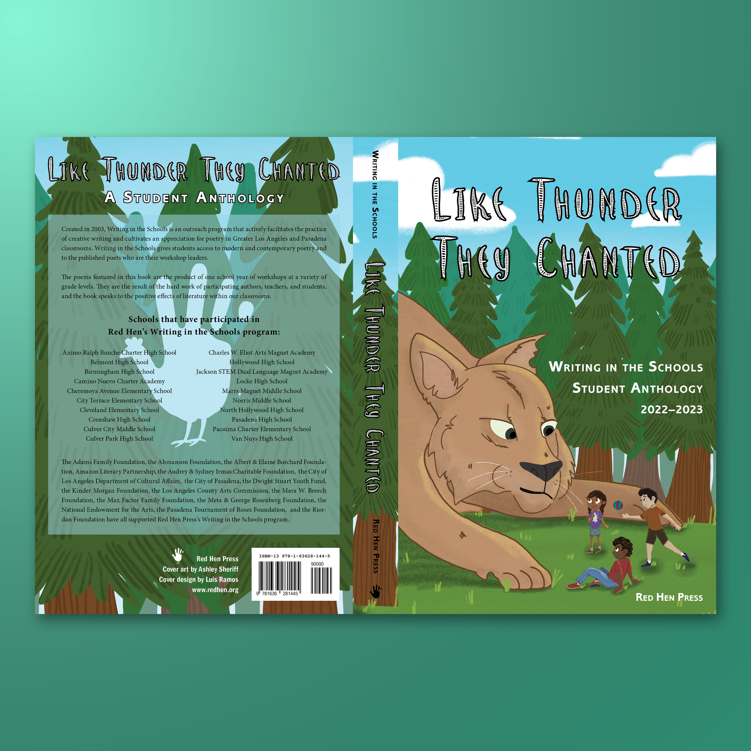
LIKE THUNDER THEY CHANTED. One of the first projects that I worked on while at RHP. An anthology filled with children's writing, which RHP strives to champion. It was the first time I worked with an artist. Please check out Ashley Sheriff's incredible work.
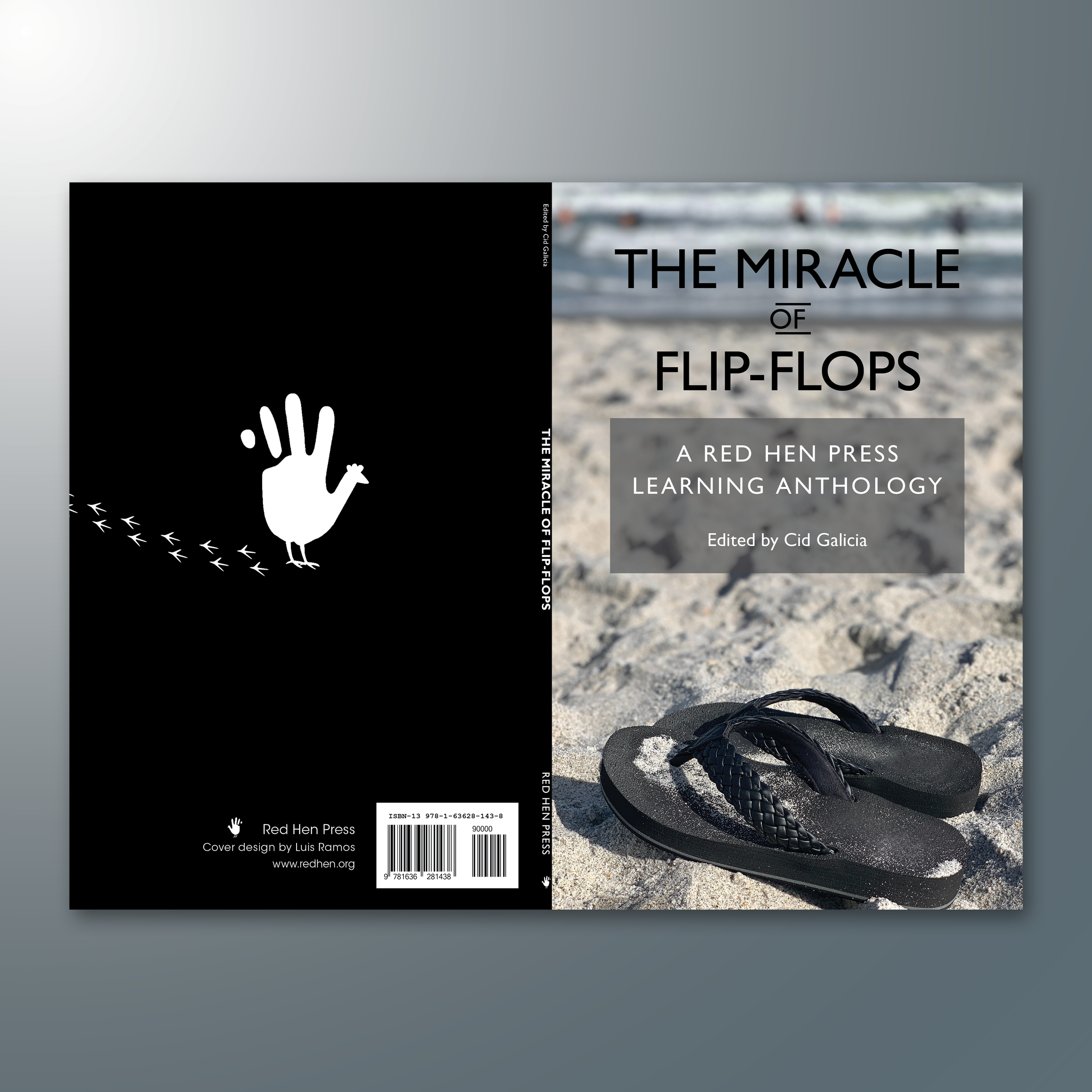
THE MIRACLE OF FLIP-FLOPS. One of my first projects I worked on at Red Hen Press. A learning anthology, which Red Hen Press publishes annually. Lots of templating work here, since every iteration of the anthology needed to be similar to the one that came before.
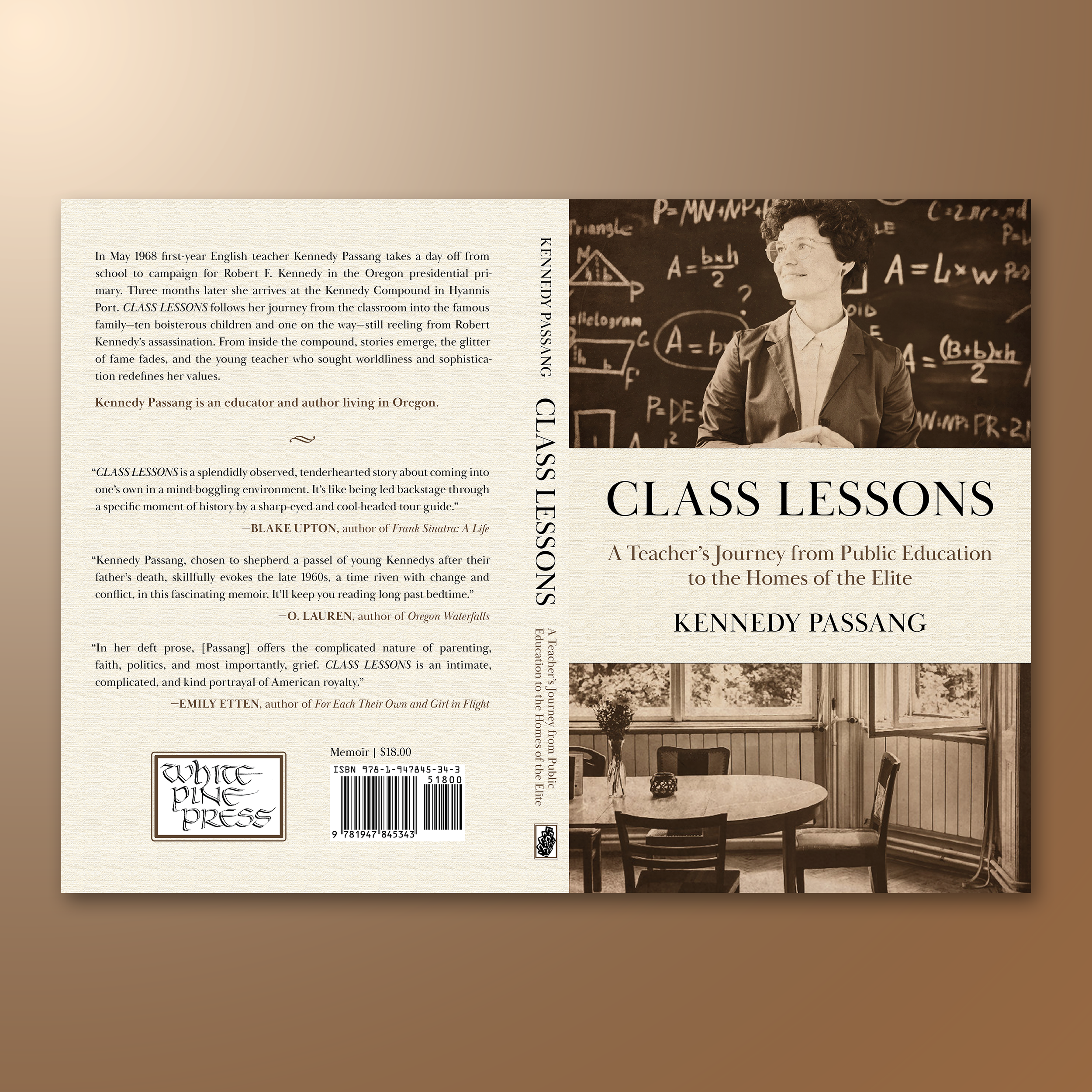
CLASS LESSONS. A school project, a simple but elegant design, that I'd like to think conveys Kennedy Passang's journey in education really well.
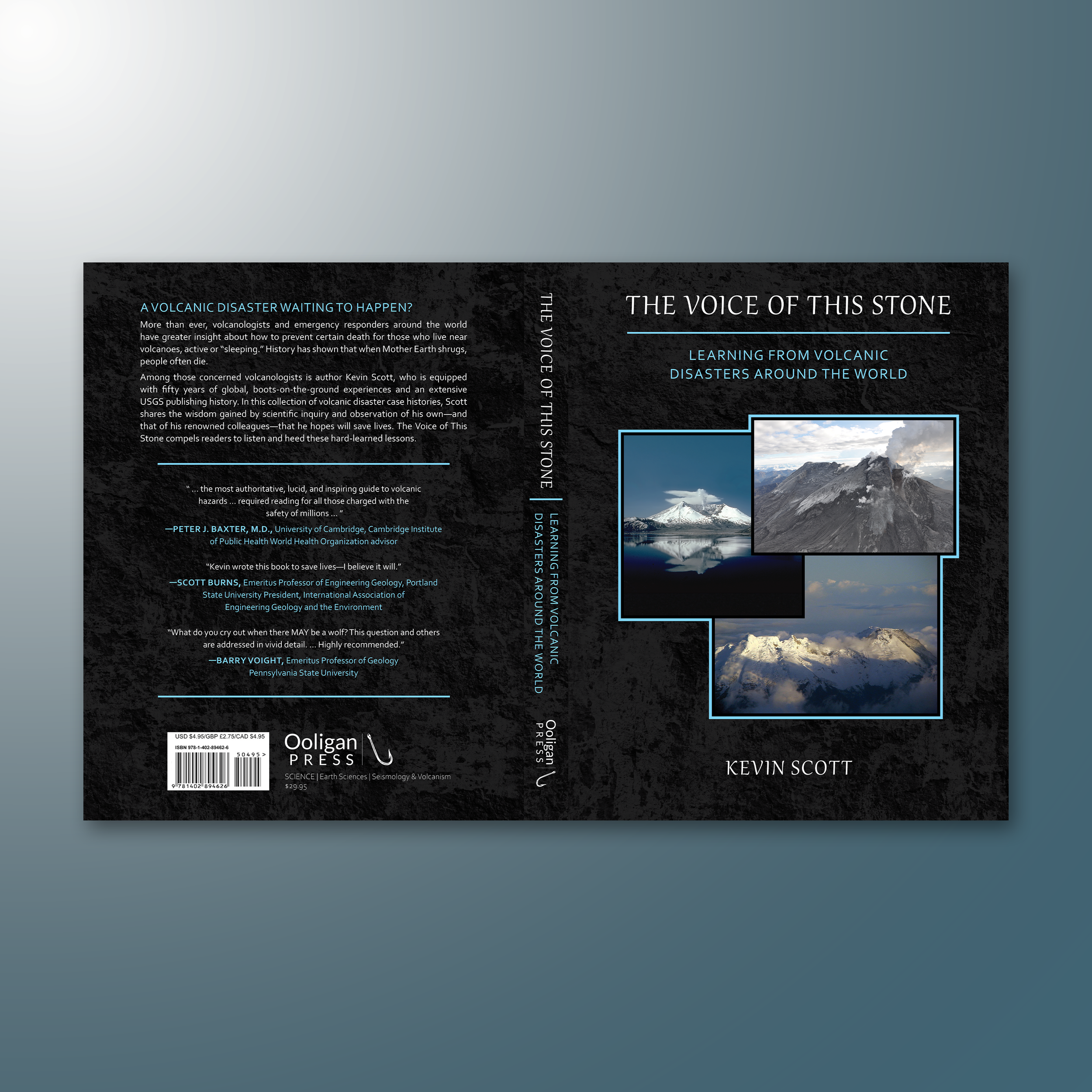
THE VOICE OF THIS STONE. My first school project. A non-fiction book about the volcanic wonders of our world. Filled with beautiful, breathtaking photos of volcanoes. I'm proud of it. Everyone always has a personal attachment to their first.
100 Book Covers in 100 Days
I tasked myself with creating a cover a day. No revisions. Just raw designs. Some took hours of work, others only a few minutes. Here are the highlights, the ones I’m willing to show. As for the rest, those I will take with me to my grave.